The LG G5 Review
by Matt Humrick on May 26, 2016 8:00 AM EST- Posted in
- Smartphones
- Snapdragon
- Qualcomm
- LG
- Mobile
- Snapdragon 820
- LG G5
Software
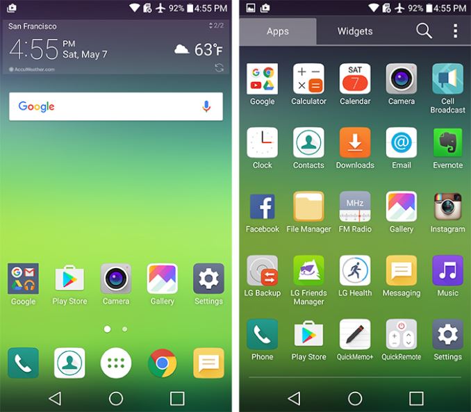
The G5 ships with Android Marshmallow 6.0.1 and LG’s new UX 5.0 skin. This version of LG’s software mainly focuses on design rather than features and continues LG’s push to simplify its interface.
LG’s UX 5.0 adopts some elements from Google's Material Design language. The included apps follow the action bar guidelines, which includes placing the action overflow button in the top-right corner and utilizing standard floating menus with drop shadows. The navigation drawer that slides in from the left functions as you would expect, and LG uses stock flat and floating action buttons consistently.
While it’s easy to recognize the UI’s Android underpinnings, the G5 is definitely not running stock Android. For starters, the G5 initially had no app drawer, similar to many Chinese OEM skins, forcing an iOS-like approach to app management. Fortunately, LG now provides an optional software update that adds this staple Android feature. Post update it’s possible to choose between a home screen with or without an app drawer.
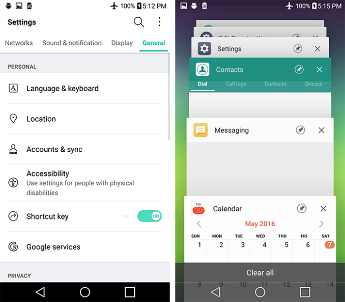
LG uses artistic license in other areas as well. The settings menu is of the custom tabbed variety with an optional list view. The task switcher is pretty standard, but LG adds a button to conveniently close all apps.
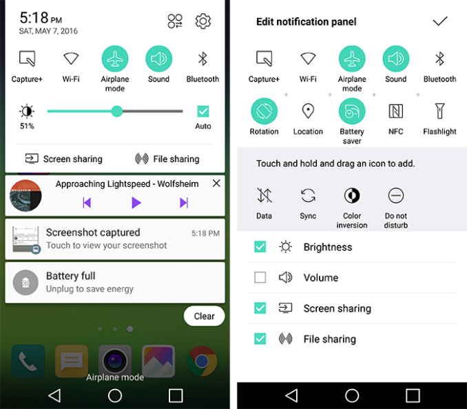
The notification shade takes on a unique look that exemplifies LG’s design style that pairs black text and thin-line iconography with an aqua accent color against a white background. This color theme is consistent throughout the settings menu and most of LG’s apps. It's a straightforward, clean looking design that avoids the visual clutter and bright colors of LG’s previous UIs.
The notification shade layout includes a horizontally scrolling array of shortcuts to various settings and apps. It's possible to customize which shortcuts are visible and in what order they appear in the array. A brightness and volume slider are both optional, as are the ‘Screen sharing’ and ‘File sharing’ buttons. Turning these optional components off frees up considerable space for notifications. Also, unlike stock Android, it’s not necessary to swipe down twice to see the quick settings—one swipe shows both the settings and the notifications.
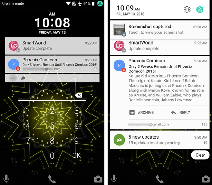
The G5’s lock screen uses Android’s standard notification system and supports all of Android’s normal security mechanisms, including swipe, pattern, PIN, password, and Smart Lock. LG does add one additional option: Knock code. This method is similar to Android’s pattern unlock except instead of using your finger to draw a pattern you create one by tapping the screen. It requires a pattern with a minimum of six taps, which can then be entered anywhere on the screen at any size. With this method, it’s a little harder to guess the correct sequence simply by looking at the smudges on the screen.
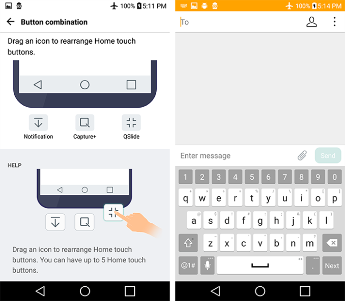
LG provides a few options for customizing the G5’s capacitive buttons. You can choose between a white or black background and can even change the button order. There's also three additional buttons, any two of which can be added to the three standard Android navigation buttons. The Notification button toggles the notification shade, which is convenient when you cannot reach the top of the screen. The QSlide button simply opens a menu granting access to the QSlide apps, which we’ll discuss more in a minute, and the Capture+ button allows you to markup the screen with doodles and text before saving a screenshot. It's also possible to auto-hide the capacitive buttons when using specific apps.
LG’s keyboard offers some customization and nice features too. The numeric keys above the top row (something I always find useful) can be hidden for more space and the top-level symbol shown by the setting and symbol keys on the left and right of the space bar, respectively, is user selectable. It's possible to adjust the height of the keyboard, either to fit more text on screen or to make the keys taller, and it can be split in landscape mode by spreading your thumbs apart, making it easier to reach all the keys with your thumbs. There's also a one-handed mode that shrinks the keyboard slightly and anchors it to either the left or right edge of the screen (this does not work with the phone dialer, though). The optional path input mode allows you to type a word by drawing a line through its letters similar to the third-party Swype keyboard. Another useful feature is the ability to swipe left or right on the space bar to precisely position the cursor. Overall LG’s keyboard is quite functional, and, more importantly, I did not encounter any accuracy or latency issues during use.
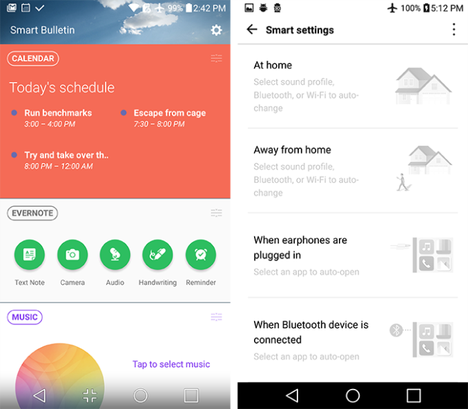
LG’s Smart Bulletin feature is an extra home screen that occupies the far left slot. The goal of the scrollable list of widgets is to put frequently accessed info and actions within easy reach. The widgets themselves are user selectable and can be reordered, but they mostly duplicate functionality found elsewhere within Android. The widget selection is also rather limited with LG Health, LG QuickRemote (IR blaster app), and LG Smart Settings the only other options. It’s not something I personally found useful, so I turned it off in the settings menu.
There’s also LG’s Smart Settings, a very basic tool for managing preferences based on location or events. Just like on the G4, it only understands two locations: home and away from home. It also does not do a whole lot, only managing sound profile, Bluetooth, and Wi-Fi settings. You cannot add any more locations or any additional options. If this does not blow your mind, it can also automatically open an app when headphones are plugged in or when a Bluetooth device is connected. To say this feature is mildly useful may be an overstatement.
LG was one of the few OEMs to include a dual-window mode, where two apps could be open side by side, with its large-screened phones. This feature is no longer included in UX 5.0, however. It’s removal is either an attempt to simplify its UI or, with native dual-window support coming in Android N, LG did not want to maintain a soon to be redundant feature.
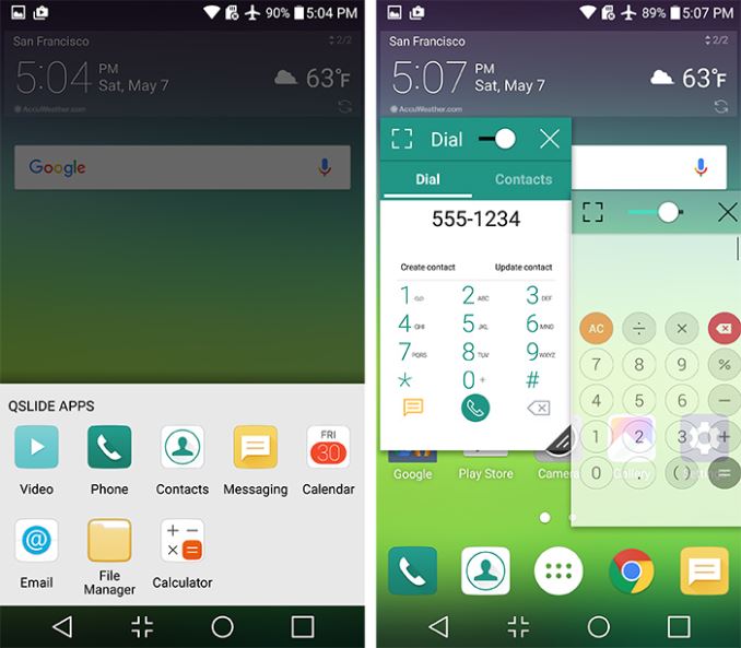
LG’s QSlide mini apps still provide some multi-window capability. These floating, windowed versions of LG’s apps can be opened using either the optional QSlide menu capacitive button or the action overflow button from within a compatible app. Up to two apps can be active at the same time, and they can be resized and repositioned as necessary. Window transparency is adjustable, and they can be expanded full-size or minimized to a floating icon by dragging them to the edge of the screen. This feature only works with a limited set of LG’s apps (shown in the screenshot below) and the G5’s 5.3-inch display is a bit confining.
LG’s UX 5.0 is less intrusive and cleaner looking than previous versions. It manages to add a few nice features, some customization options, and a functional keyboard to the basic Android experience. LG’s UI does not have as many features as Samsung’s TouchWiz, and it’s not as customizable as Asus’ ZenUI, but it comes with fewer pre-installed apps (from LG at least) and the UI remains fast and fluid.
LG needs to either develop the features it adds into something useful (the Smart Bulletin and Smart Settings features are half-baked) or just remove them and focus on creating a light Android skin that adds a few missing pieces and nothing more. Right now LG’s software does not really add much to the user experience. Then again, it does not do anything particularly annoying either.




92 Comments
View All Comments
kurahk7 - Thursday, May 26, 2016 - link
How do you check for backlight bleed in a store when it's traditionally done in a dark room? Did they let you turn off the lights in the store?BabelHuber - Thursday, May 26, 2016 - link
I had a jacket on.anactoraaron - Thursday, May 26, 2016 - link
You can leave your LG phone with the screen on for 8 hours straight and it will still report 100%. LG is notorious for this - my G4 has the same behavior where it erroneously reports 100% for too long (I believe all LG phones do this). So if your phone is fully charged and then unplugged overnight you aren't actually seeing the correct battery level/drain. I remember reading something online for 25 minutes on my G4 and it still showed 100% - which I knew wasn't right.BabelHuber - Thursday, May 26, 2016 - link
I Cannot post screenshots here, so I can hardly proof anything, but the idle battery drain without WiFi/ bluetooth turned on is about 0.1% to 0.2%.This is the best of any smartphone I have ever owned.
I'm overall pretty satisfied, but I have a European version with unlocked bootloader, rooted and decrypted. Just waiting for CM, but the stock ROM is also OK as long as you replace the launcher, phone and telephone apps.
BabelHuber - Thursday, May 26, 2016 - link
Edit: about 0.1% to 0.2% per hour.SirGCal - Thursday, May 26, 2016 - link
Same, no light bleed, battery connection to body is solid. I don't understand that argument myself either and we have 3 of them between us.pow1983 - Thursday, May 26, 2016 - link
Ah yet again 'metal is better than plastic', it never is. The majority will put a case on their phone and rarely in its life feel or see the original material again until they sell or break it. I just do not get why anyone pushes for metal over plastic. You lose more features when they migrate to metal and I think is more flimsy and delicate.And why LG did you make a smaller screen. This was going to be my upgrade until you did that :o(
Lolimaster - Friday, May 27, 2016 - link
The screen is complete sh*t calibration wise. You did yourself a favor by not upgrading,zeeBomb - Thursday, May 26, 2016 - link
Who is this Matt Humereck fellow? I heard he does great in depth reviews like this one.tipoo - Thursday, May 26, 2016 - link
Worse web browsing performance than the G4 - is it using the little cores for the whole test, like iirc the Oneplus 2?