A Look At QD Vision's Color IQ And The Philips 276E6 Monitor: Quantum Dots for Wider Color Gamuts
by Brandon Chester on April 28, 2016 8:00 AM EST- Posted in
- Monitors
- Philips
- Quantum Dot
- QD Vision
At this year's CES Josh and I sat down with representatives of QD Vision to discuss their quantum dot display technology, along with where they see the television and monitor market moving in the next few years. QD Vision offers a quantum dot solution for displays, which is branded as Color IQ. The interesting proposition that QD Vision brings to the table with their technology is that it's not just usable in high end displays, but also in less expensive ones where it can be used to bring features that were traditionally limited to high end displays down to a lower price point.
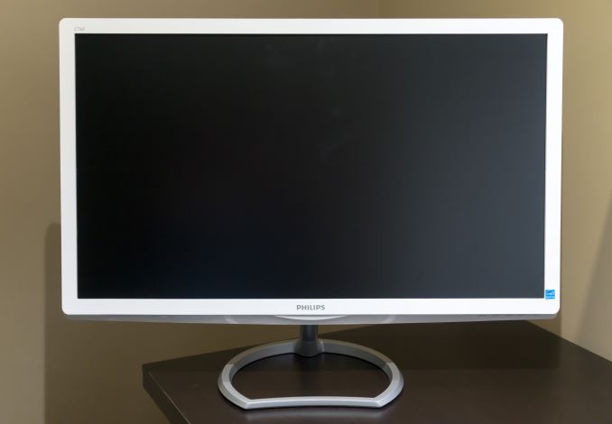
After our meeting with QD Vision, we were informed that Philips would be launching a new line of monitors that use QD Vision's Color IQ technology. Given that these are some of the first computer monitors to come to market with quantum dot technology, I was quite interested in taking a look at it. The monitor in question is the Philips 276E6 monitor, which has a 27" panel and claims to cover 99% of the Adobe RGB color gamut. The full specifications of the Philips 276E6 can be found in the chart below.
| Philips 276E6 | |
| Video Inputs | VGA, DVI-D, HDMI |
| Panel Type | IPS-ADS |
| Pixel Pitch | 0.311 mm |
| Colors | 16.7 million (8-bit) |
| Gamut | 99% Adobe RGB |
| Brightness | 300 cd/m2 |
| Contrast Ratio | 1000:1 |
| Response Time | 5ms GtG |
| Viewable Size | 27-inch |
| Resolution | 1920 x 1080 @ 60Hz |
| Viewing Angle | 178°/178° |
| Backlight | W-LED + QD |
| Screen Treatment | Anti-Glare |
| Tilt | -5° to +20° |
| Dimensions | 640 x 471 x 235 mm |
| Weight | 5.33 kg |
| Accessories | VGA Cable Power adapter |
Before moving forward, there are obviously a few points to address about the Philips 276E6. The first is the resolution and pixel density. At 27", a 1920x1080 resolution is definitely on the lowest end of the spectrum. It's very important to keep in mind that the 276E6 retails for only $300, which really isn't enough to get you a 27" 2560x1440 sRGB monitor unless you can order from Korea and dodge import fees. With that in mind, you're certainly not going to find a 2560x1440 Adobe RGB monitor for $300, and with the purpose of monitors like the 276E6 being to drive down the price of wide gamut displays, this concession makes sense. However, it is true that the pixel density of a 27" 1080p monitor is quite low, and having used a 2560x1440 27" monitor for several years now it did take some adjustment to get used to.
One other point to consider regarding the 276E6 is that, as a wide gamut monitor, it's positioning itself as a product for photographers and other professionals who would like to be able to work in a wider color space. For those applications the relatively low resolution poses less of a problem than applications that involve looking at a great deal of text. The Philips 276E6 is also just the first of many displays that will come to market with this technology, and even for users who are interested in a smaller or higher resolution panel the 276E6 will provide insight into the level of quality that can be expected from this new generation of inexpensive wide gamut displays.
As for the design of the Philips 276E6, I think it's quite unique, but I'm not sure if I'm a huge fan of it. The chassis is definitely on the flimsy side, and the fact that it's made of white glossy plastic doesn't help the visual impression that it's not the sturdiest monitor. The panel has an AG coating, but it's not as heavy as the coatings I've seen on monitors that are really heavily targeted at office use.
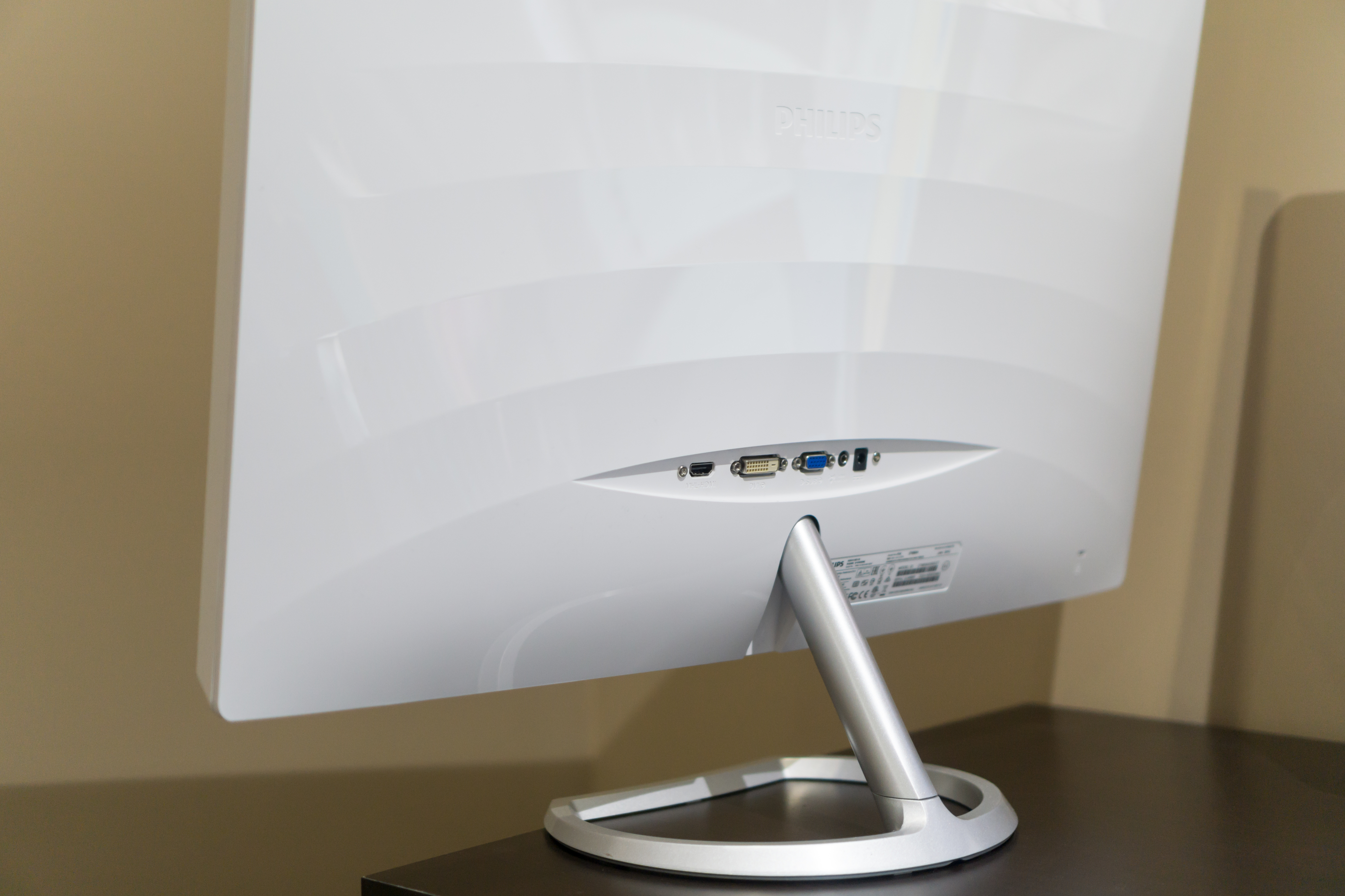
The back of the monitor is the same plastic as the front, although the chassis isn't a single component, so there is a gap between the two parts that runs around the edge. The back has a wave-like pattern, which I think looks sort of odd, but it's not really a problem since it's on the back of the monitor where it probably won't ever be seen. All the ports are back-facing rather than down-facing, and they include a port for the power adapter, a VGA port, a DVI-D port, and an HDMI port. There's also a jack for HDMI audio out.
As for the stand, it looks like a fairly study metal stand. However, that's only really true for half of it. The base of the stand is metal, and is removable, but the shaft is made of plastic and is permanently attached to the display. The stand has a degree of tilt, although tilting it too far worries me because the stand can be quite wobbly and I worry that any sudden shift or an impact on the desk may topple it.
One other thing I wanted to comment on is the OSD and the buttons for accessing it. To be quite frank, the buttons are horrible. The response is inconsistent, and you often end up hitting the wrong button by mistake and closing the menu. I wish manufacturers would just use physical buttons, as they're much easier to use and I really doubt that the impact on the bill of materials is significant.
For $300 you're not going to get an aluminum enclosure for your monitor, and in fact you don't really get that even for $1000 unless you buy Apple's Thunderbolt Display. However, I think darker matte plastic would have probably been a better option, and it should have been possible at this price point. Getting a stand with height adjustments and rotation is going to require buying a more expensive monitor, and the tilt range is as much as you'll need for a monitor of this size. Ultimately a monitor is going to be more about function than form, and that's what we'll get to next.


51 Comments
View All Comments
willis936 - Friday, April 29, 2016 - link
I'm skeptical of your first claim without seeing data.As for the second that's why packages lime dispcalgui exist.
Brandon Chester - Friday, April 29, 2016 - link
Again, that doesn't help the fact that software needs to support it. I think you're confusing greyscale calibration and color management here. If there was some easy way to fix color management across all Windows programs this would not be such a long standing issue.UrQuan3 - Thursday, May 12, 2016 - link
"Cheap colorimeters are so inaccurate that they're basically useless."I'm going to have to go with willis936 on your first comment. It sounds rather like someone driving a Ferrari saying that a Mustang has so little horsepower it is useless. To the average car owner, they're both godlike. In practice, a little $100-200 colorimeter makes a large improvement on almost any monitor. Expensive calibration for expensive monitors. Of course, use the best gear when doing a review.
I wonder how you would review calibration tools? That does not sound easy.
Pork@III - Thursday, April 28, 2016 - link
Too bad against full cover CCFLAzurael - Friday, April 29, 2016 - link
It's possible to get a 27" 2K display for $300 equivalent in Europe... I've got a Hannspree HQ271HPG which even with VAT is £200. I wouldn't say it's the best thing in the world (stuck with HDMI 1.4 & DL-DVI and hiding >1cm behind a piece of glass) but it is IPS, it calibrated up nicely (to sRGB) and the backlight consistency is much better than most cheap monitors on my sample (although it does have a bit of bleed visible at the very edges on a totally black screen.)Gunbuster - Friday, April 29, 2016 - link
I know it's a cheap monitor but dear lord, did they have to make the bezel so chunky that it looks like a 22" in photos?Haravikk - Friday, April 29, 2016 - link
Why does this include a VGA port?I'd also much prefer down-facing ports, and some kind of cable management, monitors that don't include these always confuse me.
zodiacfml - Saturday, April 30, 2016 - link
Thanks for always including a tutorial and in-depth look of color management. I quite understand the challenges of the industry.You are correct that Philips should be applauded for taking the first step as this will take time to improve as OLED/AMOLED of Samsung has improved throughout the years. For now, the Philips seems useful for increasing saturation/vividness of content for entertainment.
Questions:
1) Isn't better for Philips to target a higher color space despite coming short for now (as conversion from a bigger space to smaller seems straightforward)? The Adobe RGB doesn't improve from the sRGB space in the "reds" where the most benefit from quantum dots can be had. I believe this primary color should be given attention as content to show this is widely available in photos such as flowers, sunsets, and red sports cars. I have seen too many red subjects looking flat like plastic.
2) How does color spaces Rec. 2020 and Pro Photo RGB relate to each other? They seem to have the same coverage but obviously for different applications.
zodiacfml - Saturday, April 30, 2016 - link
I did some reading and found the problem already which is color bit depth. What are the currently supported bit depths supported by video cards and monitors?Oxford Guy - Monday, May 2, 2016 - link
AdobeRGB is obsolete.