The Huawei Mate 9 Review
by Matt Humrick on January 27, 2017 7:00 AM ESTSoftware: EMUI
The Mate 9 ships with EMUI 5.0 sitting atop Android 7.0. While features and functionality are very similar to EMUI 4.1, the previous version of Huawei’s software that shipped with the Honor 8, it receives an extensive visual overhaul along with a bump from Marshmallow to Nougat.
EMUI continues to be one of the more heavily skinned OEM versions of Android; however, instead of straying ever further from Google’s design language, EMUI 5.0 takes some design cues from AOSP. For example, overflow menus no longer hover over a grayed-out background in the middle of the screen. Now they remain anchored to the menu button and use a drop shadow rather than darkening the entire background to establish boundaries and hierarchy, more closely matching Google’s guidelines. The menu buttons too have been reworked to look more Googley. Instead of using three horizontal lines with “Menu” written below, Huawei now uses three vertical dots similar to AOSP, although some buttons still use a label.
Honor 8: EMUI 4.1 (left) vs. Huawei Mate 9: EMUI 5.0 (right)
There’s also less reliance on using the back button for navigating within an app. Many of Huawei’s preloaded apps (Email, Calendar, Notepad, Settings, etc.) now use a navigation drawer that slides in from the left edge. This helps eliminate some of the ambiguity surrounding the back button’s behavior, makes it easier to jump to different screens within the app, and better aligns with current app design.
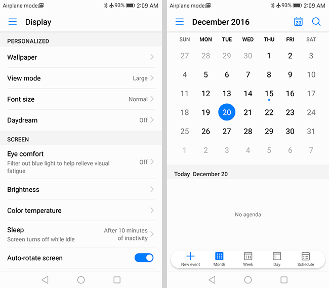
EMUI 5.0 navigation drawer: Settings (left), Calendar (right)
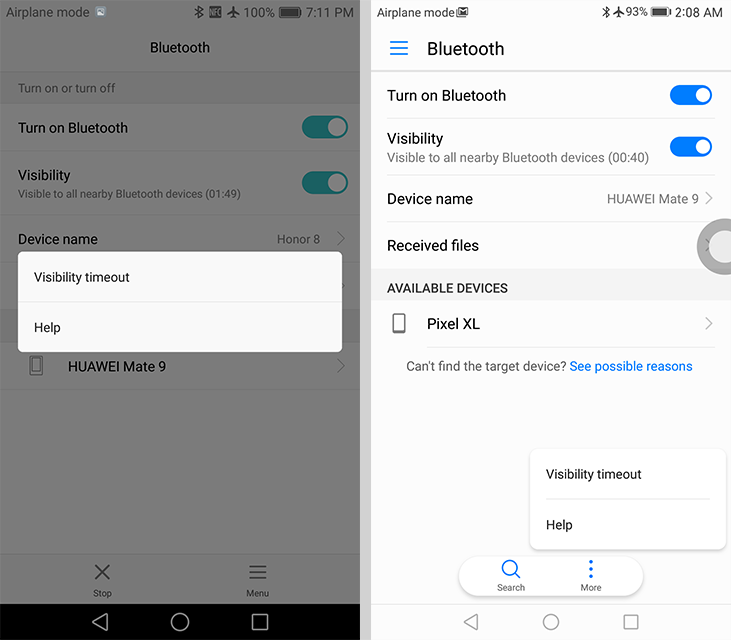
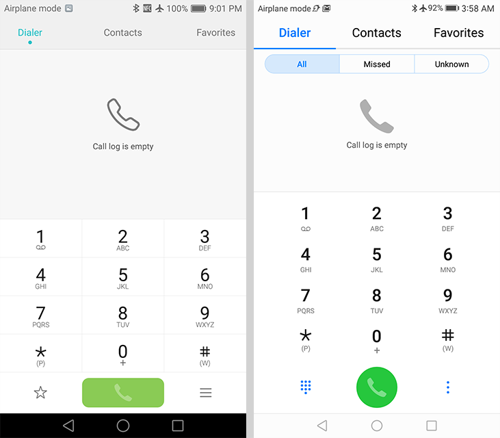
Apps that use a tabbed interface, such as Dialer/Contacts and the file manager, also receive a visual tweak. Tabs now use large text above a colored line rather than small text above a small dot, which makes the tabs easier to identify.
EMUI’s highlight color, which shows up in menus, tabs, and various interface elements, changes from aqua to a darker blue. Huawei says the new hue is inspired by the “deep blue Azure of the Aegean Sea,” although it looks suspiciously similar to the blue color Google uses. Regardless of the color’s origin, it helps give EMUI a more AOSP feel. Huawei uses the new color consistently, with it showing up in the notification shade and throughout nearly all of the included apps—Music, Videos, and Weather being exceptions. It also uses the color a bit more liberally than it did with the previous aqua color.
Honor 8: EMUI 4.1 (left) vs. Huawei Mate 9: EMUI 5.0 (right)
The icons are another obvious change. Over the past few years, we’ve seen icons become flatter, utilizing simple 2D graphics and solid-color backgrounds. Huawei reverses this trend, however, going back to skeuomorphic icons with some depth. The icon for Notepad looks like a ruled sheet of paper and Contacts shows a binder like a book. Several icons, including Settings, Flashlight, and Clock, also show more detail and depth. If these are not to your liking, there is a Theme app that allows some customization.
There are a few tweaks inside the Settings app too. Overall the color scheme and design is more consistent from one screen to the next. For example, the battery management and system update screens are better integrated and no longer look like separate apps designed by a third party. Fewer options are tucked away in the “Advanced” section, and there’s now a back arrow in the upper-left corner of nested screens. Some of the settings, particular those for managing notifications, have been moved around into more logical groupings that are easier to find.
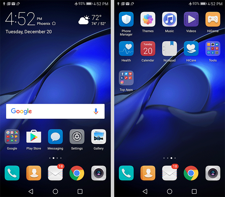
EMUI 5.0 home screen with and without app drawer
The home screen looks and functions just as it did in the previous version of EMUI. The default “Standard” view dumps all of the icons on the screen iOS style, but allows them to be rearranged anywhere on the screen(s) and grouped into folders using variable size grids.
Somewhat surprisingly, EMUI 5 adds one major new element to the home screen: an app drawer. The appropriately named “Drawer” view adds a permanent button along the bottom of the screen that opens a basic, alphabetically arranged app drawer, with a search bar at the top and a few suggested apps below. The letters along the right edge allow you to quickly jump through the vertically scrolling icon array. While the drawer itself does not offer any options to tweak its appearance or layout, it’s still a welcome addition, and a necessary concession to attract new users as it expands into additional markets outside of China.
Honor 8: EMUI 4.1 (left) vs. Huawei Mate 9: EMUI 5.0 (right)
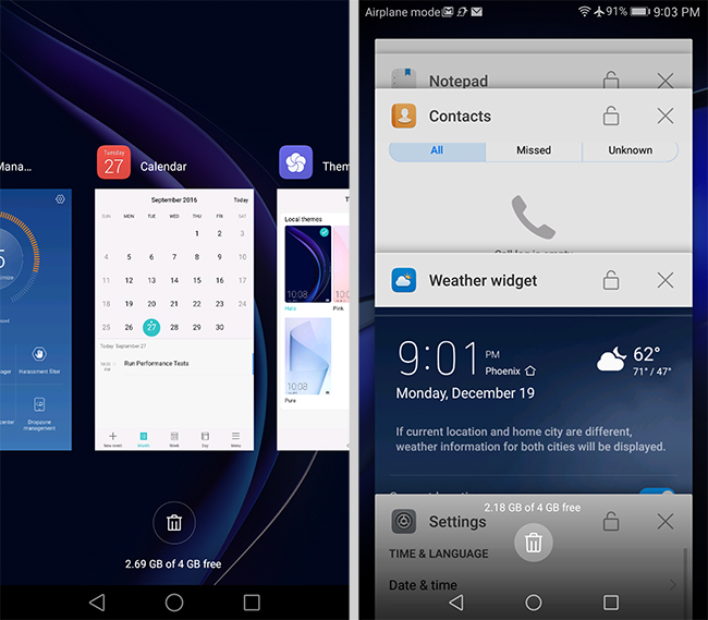
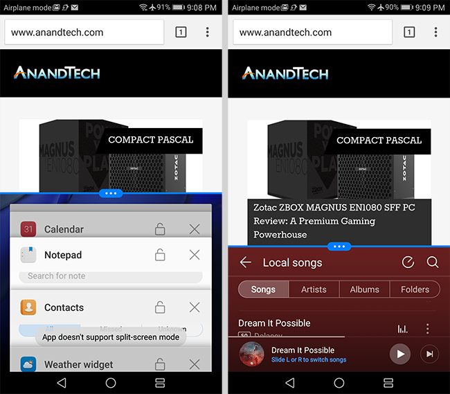
The recent apps screen is completely new too. It replaces the side-scrolling array of app preview cards with vertically scrolling cards—once again moving EMUI closer to AOSP and further from iOS. Opening and scrolling through the recent apps screen is very fast.
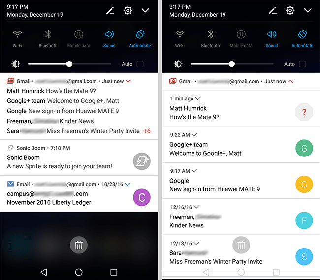
The notification shade also receives an overhaul. Notifications and quick settings are no longer divided into two tabs, and there’s also less transparency—only the portion of the screen not covered by notifications and quick settings is transparent instead of the entire background. The now unified shade includes one row of toggles, a screen brightness slider, and collapsed notifications initially. A second swipe expands the quick settings area. Tapping the pencil icon at the top allows you to add, remove, and rearrange the toggles. The notification shade no longer uses Huawei’s stylized notifications and timeline display. Instead, EMUI 5 uses Android 7’s notification system.
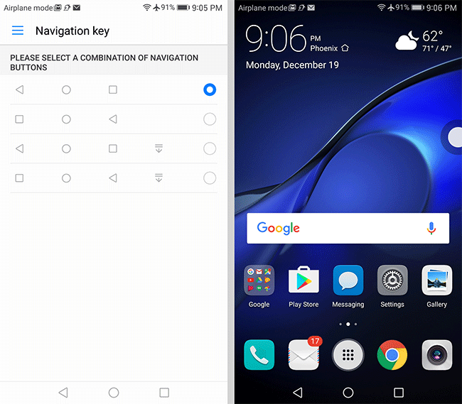
Moving past EMUI’s new look, we find a number of features beyond what’s offered in stock Android, many of which focus on making it easier to interact with the phone. Most of these are carryovers from the previous version, including the customizable navigation bar that allows the standard back, home, and recents buttons to be rearranged and an additional button to lower the notification shade to be added. The “floating dock” feature also returns. This small, circular button hovers over window content when enabled and expands into a circular menu that shows the standard Android navigation buttons, a button to clear all recent apps, and a button to lock the screen. Because it can be repositioned along either the left or right edges, it can make these buttons easier to reach in some cases; however, the expanding menu animation gets in the way of quickly accessing the buttons.
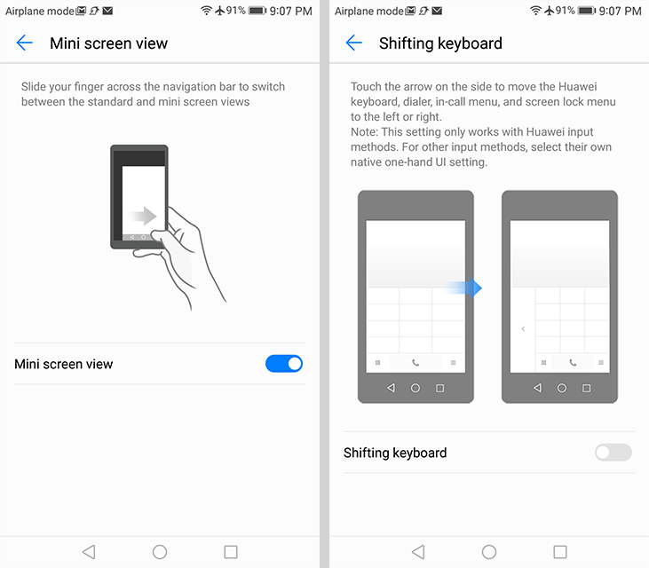
Huawei includes a few other optional features that make life on the big screen easier. The entire screen can be scaled to a smaller size by sliding a finger across the navigation bar at the bottom of the display, with the slide direction dictating whether the mini screen anchors to the lower-left or lower-right corners. The 4.5-inch equivalent screen makes one-handed use possible, although the smaller text is harder to read and it does not work when using apps in landscape mode. There’s a separate option to shrink only the keyboard/dialer and dock it to either side of the screen, but this only works within its own apps.
EMUI 5 also incorporates Android 7’s multi-window mode that displays two apps side by side or above and below depending on whether the phone is held in landscape or portrait mode. The apps are resizable by dragging the divider and can be swapped from one side to another. Window management works the same as AOSP. The Mate 9’s display is big enough to make this a useful feature in many cases, although it does not work quite as well when trying to input text, either because of how much space the keyboard consumes (landscape view) or trouble getting the keyboard to appear at all (portrait view).
When not being used for identification purposes, the fingerprint scanner functions as a secondary touch interface. Sliding a finger up or down over the sensor raises or lowers the notification shade (it can be any finger—enrollment not required). Double-tapping the sensor with the shade down clears notifications. Other functions are context dependent: swiping left or right browses through photos in Huawei’s Gallery app (but not in Google’s Photos) and holding a finger on the sensor will answer a phone call, turn off an alarm, or take a photo when the Camera app is open.
The Mate 9 responds to more than just fingertips, though: You can also use your voice and knuckle gestures. Tapping the screen twice with a knuckle takes a screenshot, while doing the same thing with two knuckles will start and stop a screen recording. You can also tap the screen with a knuckle and draw a letter to launch an app. While the Mate 9 has only been trained to recognize four letters, you can choose which apps they open. There’s also a shortcut for enabling the multi-window mode: tap the screen with a knuckle and then use it to draw a horizontal line. This gesture is particularly satisfying, because it gives you the sense of cutting the screen in half, although, like the other gestures, it requires the use of two hands—one to hold the phone and another to make the gestures. These gestures work within apps, on the home screen, and on the lock screen (but not with the screen turned off) where it makes sense.
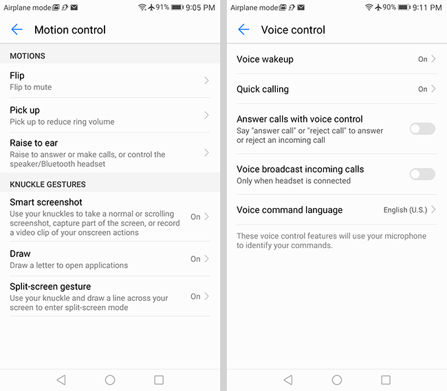
The knuckle gestures are powered by FingerSense from Qeexo, a company spun off from Carnegie Mellon University. At its heart is a lightweight machine learning engine used for classifying touch inputs. Once the OEM and Qeexo train the neural network and optimize its output (to ensure uniform response across the screen, for example), the software-based model is embedded in the phone’s firmware. This solution does not require any additional hardware, instead relying on data from the display’s touch controller, which runs at a higher sampling rate when the screen is on, and vibration data from the phone’s accelerometer. It works by listening for certain vibration signatures that originate from the screen. This is why it’s essential to use the bony part of your knuckle instead of the softer sides, and to hold the phone firmly in your hand or place it on a hard surface to improve recognition accuracy. After a little bit of practice, I found the gestures to work pretty reliably, with my biggest issue being the timing between the first knuckle tap and the follow-up gesture that tells the phone what action to take. If done too quickly, it will take a screenshot instead of letting you draw a letter, for example. Update: This issue was actually the result of user error. To open an app using the letter gesture, you only need to tap the screen once with your knuckle before drawing the letter (without lifting your knuckle from the screen). Now that I know what I'm doing, the gestures actually work reliably.
Compared to previous versions, EMUI 5’s visual overhaul makes it look and function more like Android AOSP than Apple’s iOS, which should reduce the learning curve for people migrating from other Android phones. Huawei’s more consistent use of color and navigation elements makes the phone easier to use overall, and the more streamlined interface means “90% of functions can now be activated in just 3 steps,” according to Huawei. Personally, I feel EMUI 5 is a nice upgrade. It contains some useful features and manages to be visually distinctive without completely betraying its Android underpinnings.


84 Comments
View All Comments
Matt Humrick - Friday, January 27, 2017 - link
This is why I like to see OEMs include multiple screen modes or other methods to adjust display parameters, and why I take the time to test and show the results for them in my reviews.Ethos Evoss - Thursday, February 23, 2017 - link
really only shame is huawei not bothering optimising video recording .. compare to galaxy 6 or 7 crapstuttering when moving from right to left ... on old iphone 6 and old galaxy s6 video recording at 1080p60 is simply the best ..
beepboopbop - Friday, January 27, 2017 - link
The biggest benefit I see from a perfectly calibrated display is that you'll be seeing media as it was meant to be seen.mrvco - Friday, January 27, 2017 - link
What media is "meant" to be seen on a tiny mobile phone screen?akdj - Tuesday, January 31, 2017 - link
Maybe the picture you take or video you attempt to capture... and 'edit' - possibly the movie you watch (5.9" after all! With speakers to boot) or the photos you view, games you play, video calls you make, there's even apps that will allow for capturing colors for Adobe profiles (for creatives) -- More and more folks' phones have become significantly more, for many... it's their primary computerAnd IMHO, with so many OEMs delivering accurate displays today, crappy ones tend to stand out and make it nearly impossible to use that phenomenal camera to it's full potential
Nitemare3219 - Friday, January 27, 2017 - link
The "average consumer" isn't checking Anandtech for reviews. I truly appreciate the color accuracy testing. Having at least a SOMEWHAT color accurate display is appreciable, once you actually use one. Some devices have colors that are way, way off and things just look ridiculous.BrokenCrayons - Friday, January 27, 2017 - link
One of the things Anandtech does in reviews that's different from most other tech sites is in-depth display analysis of all the deivces (those with displays anyhow) that they handle. Although someone like me that uses a computer to write books and fetch e-mail isn't concerned about such things, I think a pretty big percentage of AT's readers care quite a bit. Plus, putting attention on display quality may encourage device manufacturers to focus more on that sort of thing over time.If it's not important to you, just skip those portions of the review. That's what I usually do with screen testing portions.
GC2:CS - Friday, January 27, 2017 - link
I think the number one most underrated feature on display is AR coating.For me iPhone 7 - higher brightness OK, better efficiency - superb, more saturation - great.
But a AR coating even on the level 2014 iPad Air 2 would enhance all those measures much further.
It should be noted more by the reviewers.
Meteor2 - Friday, January 27, 2017 - link
This is true. The anti-reflective coating makes a bigger difference to usability outdoors than screen brightness. The iPad Air 2 and Pro really excel there.lopri - Friday, January 27, 2017 - link
There is not much else to talk about this phone's display. This is a plain old LCD with inaccurate colors. All other LCD shortcomings apply as well. High brightness is nice but that cannot replace the versatility of high contrast (e.g. AMOLED).