The OnePlus 6 Review: Among The Best Of 2018
by Andrei Frumusanu on July 27, 2018 8:30 AM EST- Posted in
- Mobile
- Smartphones
- OnePlus
- OnePlus 6
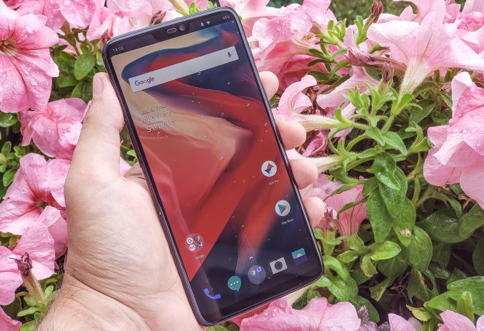
Over the last several years OnePlus has evolved from a vendor looking to disrupt the smartphone market to a company whose flagships are now eagerly awaited every year. The OnePlus 6 is the company’s biggest design change yet, and brings with it flagship specifications while still maintaining its characteristic advantage in terms of product pricing as well as long-term software support.
I have to admit that for me personally this will be the first time I’d have reviewed OnePlus device as I had missed out on past reviews and we’ve had a coverage gap last year when it came to mobile devices. As such I’m pretty much coming into the review of the OP6 with no pre-conceptions about either hardware or software of the phone, and based on what I’ve seen over the last couple of weeks and what you’ll get to read over the following pages, I’ve been massively impressed.
| OnePlus 6 | |
| SoC | Qualcomm Snapdragon 845 4x Kryo 385 Gold @ up to 2.80 GHz 4x Kryo 385 Silver @ up to 1.77 GHz Adreno 630 @ up to 710 MHz |
| Display | 6.28-inch 2280x1080 (19:9) AMOLED |
| Dimensions | 155.7 x 75.4 x 7.8 mm 177 grams |
| RAM | 6GB / 8GB / 8GB LPDDR4x |
| NAND | 64GB / 128GB / 256GB |
| Battery | 3300mAh (12.7Wh) |
| Front Camera | 16MP Sony IMX371, f/2.0, EIS |
| Primary Rear Camera | 16MP Sony IMX519 1.22µm pixels, f/1.7, OIS |
| Secondary Rear Camera | 20MP Sony IMX376K, 1.0µm pixels, f/1.7 Low-light & Depth |
| SIM Size | 2x NanoSIM |
| Connectivity | 802.11ac 2x2 WiFi BT 5.0, NFC |
| Interfaces | USB 2.0 Type-C; 3.5mm audio |
| Launch OS | Android O (8.1) with OxygenOS 5.1 |
| MSRP Launch Price |
6GB/64GB: ¥3199 / $529 / €519 8GB/128GB: ¥3599 / $579 / €569 8GB/256GB: ¥3999 / $629 / €619 |
Starting off with the specifications of the phone, this is indeed a 2018 flagship phone as it comes with the latest Qualcomm Snapdragon 845 SoC powered by 4x Kryo 385 Gold (Cortex A75 based) up to 2.8GHz and 4x Kryo 385 Silver (Cortex A55 based) up to 1.77GHz. We’ve had extensive coverage on the SoC starting off with the announcement piece, to our performance preview and our in-depth investigations included in the Galaxy S9 review. To say the least, every Snapdragon 845 device over the last couple of months has been very impressive and I’m not expecting any less from the OnePlus 6.
OnePlus really opted to give the OP6 a more than generous amount of RAM as well as high storage capabilities. The base model comes with 6GB LPDDR4X and 64GB of UFS storage, with the larger 128GB and 256GB (!!) models sport 8GB of RAM. The 8GB of main memory seems overkill as in daily situations the phone rarely uses more than 3.5GB, so there’s still massive amounts of headroom available for memory hungry applications or heavy multi-tasking. I commend OnePlus on the 256GB variant of the phone as not only does it makes up for the lack of a microSD slot, but actually comes at a relatively reasonable price premium compared to what other vendors ask for higher-capacity models.
The OP6 comes with essentially all required global frequency bands and as such the phone should be an option and of interest to anybody, regardless of market and carrier frequency bands.
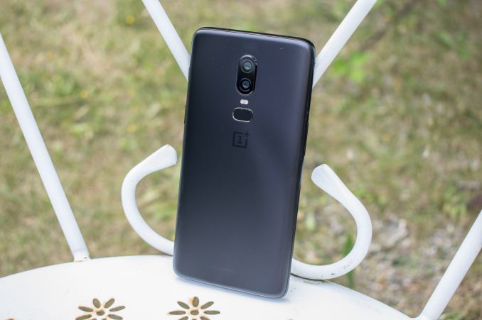
Design-wise of course the OP6 marks a generational step it has ditched the metal body of its predecessors and for the first time opted to use a glass back on the phone. The phone comes in four different colours and two finishes: The recently announced red variant as well as the launch model “mirror black” come with a regular shiny glass finish. The “pearl white” and “midnight black” variant, the latter of which is depicted in the review, both have a matte finish which tries to mimic a polished metallic look. Personally I found this finish to be very interesting and do prefer it a lot to phones with the regular glossy glass; however some people have noted that it might be too slippery so it’s certainly something subjective and depending on personal preference.
As Ian noted in our initial hands-on article, one thing that you would expect with the inclusion of a glass panel back is the ability to wirelessly charge the phone. Unfortunately OnePlus doesn’t see the need to include this into their phones as of yet as they deem the ecosystem too immature and found wireless charging not commonly used. Obviously this is a chicken-and-egg issue, and while lately I have increased my usage of wireless charging and even now have a pad next to my bed, I don’t find the lack of it all that troublesome for a device. It’s also possible that including a wireless charging coil would have resulted in an ever so slightly thicker phone, which given the overall larger dimensions of the device would have likely hampered its ergonomics.
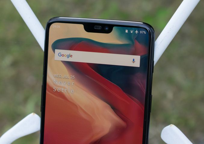
One controversial addition to the OnePlus 6 is the display notch. Here the screen extends upwards to the sides where usually we would’ve found the top bezel of the phone. In the middle cut-out we find the earpiece flanked by one side the sensor array and notification light, and on the other side the 16MP front-facing camera. As I’ve talked about in our review of the Huawei P20 and P20 Pro, the notch is absolutely not bothersome at all in daily usage and can be blacked out via software option, something that works extremely well on the AMOLED screen of the phone.
Speaking of screens, the OnePlus 6 sports an AMOLED screen with a 6.28” diagonal. Again the diagonal has little meaning nowadays as the 19:9 aspect ratio screen doesn’t properly convey the actual size of the device. At 75.4mm wide the OnePlus 6 is 1-2mm wider than some of the competitor devices in the same size range; however the very thin rounded sides of the phone do help it a lot in terms of ergonomics so it’s still extremely useable. One aspect that OnePlus could have in my opinion done better with the OP6 is to try to reduce the side bezels just a bit more as I think that would have made for a much sleeker look.
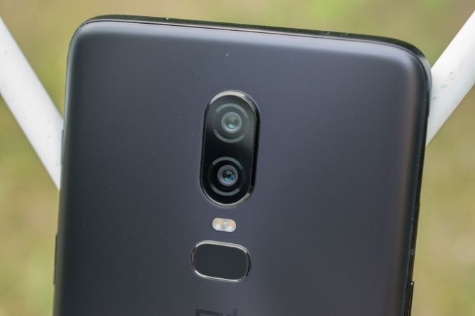
At the back of the phone OnePlus rearranged its camera positioning from the top left corner to the middle with a vertical dual-camera layout with the flash and fingerprint sensor located underneath. Camera wise the main rear sensor is a Sony IMX519 sporting a 4608x3456 resolution (16MP) and has a pixel pitch of 1.22µm. The CMOS is supported by a f/1.7 lens with a 35mm equivalent focal length of 25mm and the module includes OIS.
The secondary sensor is also a Sony sensor coming in at 20MP and f/1.7, however this isn’t a telephoto lens but rather a OnePlus unique use-case where the secondary sensor is used sometimes in low-light conditions as well as for depth data in capturing modes such as portrait mode. We’ll look into the camera evaluation extensively in another large comparison across a wide variety of recent flagship devices.
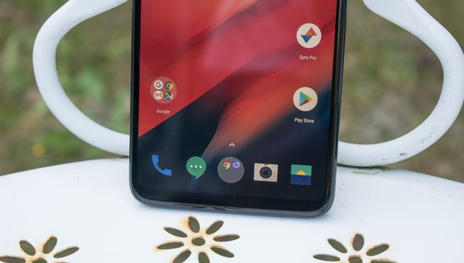
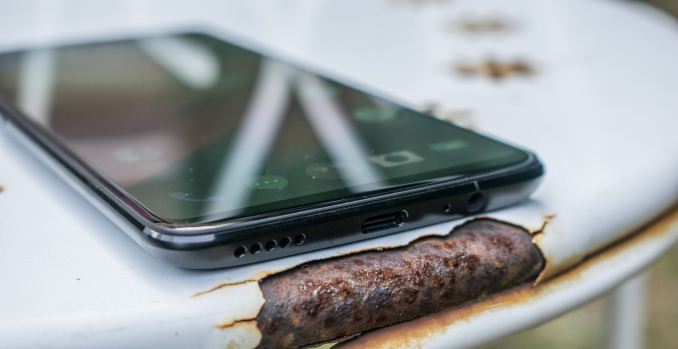
At the bottom of the phone we find a single bottom-firing speaker which we evaluate later on in the review, the phone’s USB-C connector port, the bottom microphone as well a 3.5mm audio jack. Keeping the 3.5mm jack is definitely an advantage for the OP6 as the company evidently resisted the popular urge to restrict user choice on the matter. As a note, I’m still looking into rebuilding our audio evaluation methodologies, but likely won’t have anything ready until later in the year.
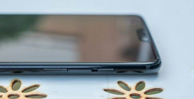
On the left side of the phone we find the SIM tray which contains two nanoSIM slots, with the volume rocker located underneath.
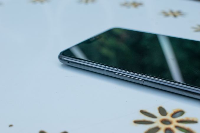
On the right side we find a slider button which acts as a hardware switch to quickly switch between the three states of silent, vibrate only and regular ringing, a feature that’s essentially not found any more in many Android devices.
Overall the OnePlus 6’s design is very impressive – build quality looks and feels very solid. It’s a large phone but thanks to its ergonomics it still manages to achieve very good usability. Some people will have concerns about the new glass back of the phone and how that affects durability, but personally I don’t mind it at all and find the matte finish variant extremely pleasing.




90 Comments
View All Comments
jospoortvliet - Thursday, August 2, 2018 - link
On screen buttons, really? the 90's want you back... Nokia n9 and Palm WebOS showed the future years ago, it is a bloody shame it took Apple to bring it to Android. Very disappointing to notice so clearly that Google only innovated when forced, even though the better paradigm was already shown to work and just lying there to be adopted..Thefinn - Friday, July 27, 2018 - link
Yeah, notch makes it useless. I don't think so.What are you smoking? It's actually a great phone, but to each his own
amosbatto - Wednesday, August 22, 2018 - link
The problem with the notch is that it gives less space for the notification icons, which I find useful. Even worse is that 19.5:9 screens leave no room for front-facing speakers. Decent audio is far more important than more vertical pixels which I will never use. Also, the smaller the bezel, the less protection for the screen. Of course, when you make phones entirely wrapped in glass, you basically are inviting for it to be cracked. Unfortunately, nobody makes a decent phone like the LG V20 anymore, that is durable and designed to survive drops.128bit - Friday, July 27, 2018 - link
I'm using s9 plus and iphone x and nope screen of s9 plus might be has higher resoulation and excellent brghtiness, but still not as good as iphone x OLED there's black crash at low brightness even though its made by samsung. Apple knows how to calibrate there screen very well and notch isn't on iphone x like android phones wanna be iphone.id4andrei - Saturday, July 28, 2018 - link
The problem you're referring to is an Android problem and that is the lack of a proper color management system. Samsung has color profiles corresponding to different standards such as sRGB or AdobeRGB built in but it's not a full solution.Skelter - Friday, July 27, 2018 - link
After one month with the phone, I don't get the notch hate that seems to be trending in all tech related sites. There's really no downside to it. It hides on its own when needed and gives you extra screen space over what would have been otherwise a bezel. If you really hate how it looks, you can just hide it and the device will look like it was made with the same bezels the S9+ has.The only downsides the phone has, in my opinion, are the speaker (not bad, but not flagship worthy either), the glass back without wireless charging (not a deal breaker at all, but it would have been nice to get either Wireless Charging or a tougher design) and the camera (which is, at least since the last update improved its quality, almost as good as Pixel 2/iPhone X/S9).
By the way, I wouldn't say Samsung's S9 has "nearly the same price". Even if you buy the cheapest S9 model Samsung is offering, there's still a $140 difference. Maybe it's worth it for some, since its screen is the best there is (even if it is smaller in the basic S9 model), its camera is slightly better and it has Wireless Charging and an IP68 rating. But that doesn't make OP6 a bad choice at all.
johnhopf - Friday, July 27, 2018 - link
Your review is great, but I really object to this kind of camera evaluation.The only way you can take a decent landscape shot with the sky in it, is if the sun is setting behind you so the sky in front of you is dark and the scenery is illuminated.
When you take a photo of midday sky and trees underneath it, the sky is probably 50 times brighter than the trees, and the only way to bring them in line is insane over-the-top "hdr" that gives the whole image the same mezzo-blah brightness.
I'd recommend looking at real art photography for a while, to see how the shadows actually clip into blackness. My favorite photographer lately is Jay Maisel, and he has lots of good photos on his website.
Andrei Frumusanu - Friday, July 27, 2018 - link
> When you take a photo of midday sky and trees underneath it, the sky is probably 50 times brighter than the trees, and the only way to bring them in line is insane over-the-top "hdr" that gives the whole image the same mezzo-blah brightness.> I'd recommend looking at real art photography for a while
Sorry to be blunt here, but most people don't care about art photography. The notion that you can only take a picture with the sun behind you is also outdated, the average person is not going to follow any of that advice. On the day I took those pictures I had dozens of tourists around me taking the pictures with their smartphones, for those people, they expect the smartphone to just deal with the circumstances.
The point of these comparisons is to put the phone into difficult situations and see how they behave. Computational photography is very much a thing and it opens up new avenues. Look at the bridge photo of the P20Pro - it manages to do that because it has the technology in the sensor to do a different exposure for each physical pixel in the binned logical pixel, resulting in outstanding DR. Also as demonstrated by the OP6 here and some other phones, the results can actually be quite good if the HDR is well tuned.
If one phone manages to do well then it means it raises the bar in terms of what's to be expected of other flagship devices in general.
FunBunny2 - Friday, July 27, 2018 - link
if memory serves, Maisel has been using a view camera and contact printing for rather a long time. in any case, the dynamic range of film, using zone method, beats any minuscule phone sensor by a light year or so. but, just like the Kodak of the 1940s, phone snapshots aren't intended to be anything more than momentos. even a $100 digital camera will do better.Impulses - Tuesday, July 31, 2018 - link
I'd be surprised if any camera <$400 did better than a phone tbh, under that price bracket they'd feature the same miniscule sensors and often slower lenses (possibly better corrected and definitely able to stop down, but it's debatable how much you really need to stop down for DoF with these small sensors).Meanwhile smart HDR/stacking algorithms will definitely give phones an edge, these modes tend to suck even in high end cameras and photography enthusiasts just do it manually in post. Past $400 or so cameras definitely jump ahead tho, at that point you can easily buy something with a 1" (Canon G9 X) or even 4/3 sensor (Panasonic GX850).
Obviously these are not exactly $400 phones either, even the OP has blown significantly over that threshold, but still... I'm all in favor of suggesting people look at cameras rather than side-grading phones for marginal gains tho. I was impressed by my Pixel but I didn't buy it for the camera and still vastly prefer my dedicated cameras.