Microsoft's Windows Media Player 10 - Providing Some Pointers
by Andrew Ku on September 19, 2004 12:00 PM EST- Posted in
- Smartphones
- Mobile
Lessons to Learn - Low Profile, Low Profile, Low Profile
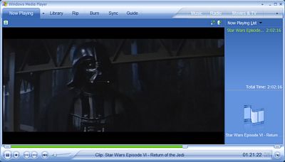
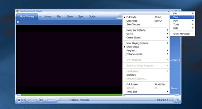
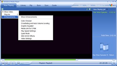
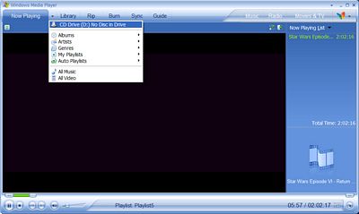
The low profile look of WMP10 over WMP9 is the direction that we like to see multimedia software go. By this, we are specifically pointing to subtle things like the migration of the drop-down menus to the upper right hand corner.This is something that DVD software players, multimedia file players, PVR titles and home theater PC (HTPC) software titles should try to emulate. The fact of the matter is that the configuration process for the mass is becoming more of a one-time thing, which is why there has been a move to emphasize the low profile of lesser used functions. However, the configuration options still need to be accessible easily enough so that it can be done on a day-to-day basis for those enthusiasts who like the option of more controls.
Perhaps one of our biggest complaints of other multimedia software titles is the lack of the track slider not extending by the same factor that the player does. What we mean by this is that when you enlarge the size of the window, the track slider should also enlarge. Some software titles keep their track slider at a particular length, no matter how you manipulate the size of the window (e.g. NVIDIA's NVDVD 2.55). Ideally, the longer the track slider, the better the experience because this allows users to get to a specific spot in a video file or DVD easier.
And it isn't just the size of the track slider with which we take issue; it is also the elapsed portion before the track pointer. There definitely needs to be some sort of a different color scheme that indicates the portion of the multimedia file/DVD movie already past. In WMP10's case, Microsoft uses a neon green scheme before their track pointer.
One of the other things that we have been noticing is the use of odd curves and/or shapes in the design of user interfaces (UIs) occasionally. In our opinion, this isn't aesthetically appealing or functional in the practical sense. In our experience, the best design is still the straightforward approach with a twist: a rectangular/square window with rounded edges.
All of the other UI features should be designed in such a way that they don't actually feel like you are using your TV remote control - buttons stick out like a sore thumb. To maintain that low profile, the "buttons" should blend into the background, at least when they aren't selected or during a mouse-over. Basically, when you aren't monkeying around with the controls of the multimedia player, it shouldn't really look like you are looking at any buttons because they will blend in with the frame, which should be somewhat thin to begin with. You are just using the program as a medium to watch your multimedia content, and the last thing you need are big borders that cut down on available screen real estate and/or clutter the screen. This is something that Microsoft generally has done for MCE and WMP10.
Aside from this, there are the small things that we still want to see in other programs, if they haven't already been implemented, like the ability to see text on the player indicating elapsed time, elapsed time over total time, time remaining, current play status, etc.
The bigger indicators are also important for a 10ft. UI deployment, i.e. Microsoft's MCE/MCE2004's mute icon, volume increasing and decreasing indicators, etc. Personally, Microsoft can go a long way by migrating a few 10 ft. UI indicators from MCE to WMP. Actually, it would be nice to have a 10 ft. UI for WMP in general.


12 Comments
View All Comments
sprockkets - Sunday, September 19, 2004 - link
The best part of WMP10 is that it's XP only, which is so ridiculous but why not, make it seem that XP can only handle it.JustAnAverageGuy - Sunday, September 19, 2004 - link
I assume you're still writing the article?