Dell XPS 410: Core 2 Duo for the Masses
by Jarred Walton on September 18, 2006 12:20 PM EST- Posted in
- Systems
Externals and Appearance
We said that the 2407WFP display is probably the most impressive part of the configuration we were sent for testing. However, the system design is really good as well. Almost everything is completely tool-less, and accessing the internals and changing components is extremely easy. Let's start with the outward appearance first.
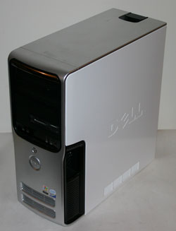
In a break from tradition, the case is all white with the Dell logo embossed on the sides. After seeing many beige, black, and varying other colors of cases, the pure white design is a nice change. Some might say that Dell seems to be copying the white appearance of Apple's iMac computers, but if you are looking to copy aesthetics there are far worse choices than Apple.
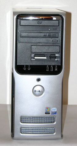
The front panel is a more traditional design, with black drive bays set in a silver mold. At the top of the case is a chrome XPS 410 logo, and at the bottom are the air intakes for one of the internal fans. Above the Dell logo, you can see the power switch, and you also have access to the front audio ports, two USB ports, and a FireWire port (provided you get the optional FireWire PCI card).
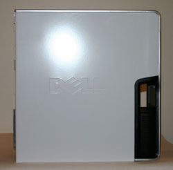
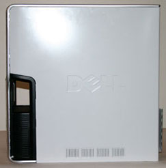
The left and right sides of the case are virtually mirror images of each other. The only difference is that the right side has some ventilation slots at the bottom of the case. If you're wondering about the black cutout towards the front of the case, that is part of the BTX design Dell has used. This provides an air intake for the main 120mm fan that cools the CPU heatsink and also provides ventilation to the inside of the case. Some form of ducting could have been used instead, so the cutout seems to be more for adding visual flair than because it was absolutely required.
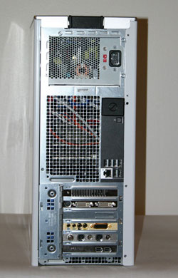
Besides the typical connectors you would find at the rear of any PC, there are a few interesting points about the Dell XPS 410. First, note how there's a huge ventilated area in the middle section of the case. This matches up with the 120mm fan located at the front of the case, with the CPU heatsink sitting in the middle. Basically, this provides a great way for getting all of the hot air generated by the CPU and other components out of the system. You can also see that the standard I/O panel is dramatically different from what most people are used to. There are no PS/2 keyboard or mouse ports, nor are there serial or parallel ports. Instead, you get six USB 2.0 ports, a Gigabit Ethernet port, and an S/PDIF optical out connection. Above the S/PDIF port are the audio ports, which are hidden by a small cover by default. If you use the system as an entertainment center PC, the optical out would be the preferred connection, though most people will more than likely use analog speakers.
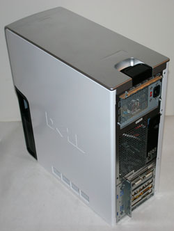
The last two items worth noting on the rear of the case are better viewed from a different angle. At the top you can see the latch that pops open the right side of the case. This makes it extremely easy to open up the system for upgrades or maintenance. At the bottom just above the expansion card slots you can see a protruding hinge. We will take a closer look at how this works when we get to the internals next, but basically it's part of the tool-less design that allows you to install or remove expansion cards very easily.
We said that the 2407WFP display is probably the most impressive part of the configuration we were sent for testing. However, the system design is really good as well. Almost everything is completely tool-less, and accessing the internals and changing components is extremely easy. Let's start with the outward appearance first.
 |
| Click to enlarge |
In a break from tradition, the case is all white with the Dell logo embossed on the sides. After seeing many beige, black, and varying other colors of cases, the pure white design is a nice change. Some might say that Dell seems to be copying the white appearance of Apple's iMac computers, but if you are looking to copy aesthetics there are far worse choices than Apple.
 |
| Click to enlarge |
The front panel is a more traditional design, with black drive bays set in a silver mold. At the top of the case is a chrome XPS 410 logo, and at the bottom are the air intakes for one of the internal fans. Above the Dell logo, you can see the power switch, and you also have access to the front audio ports, two USB ports, and a FireWire port (provided you get the optional FireWire PCI card).
 |
 |
| Click to enlarge | |
The left and right sides of the case are virtually mirror images of each other. The only difference is that the right side has some ventilation slots at the bottom of the case. If you're wondering about the black cutout towards the front of the case, that is part of the BTX design Dell has used. This provides an air intake for the main 120mm fan that cools the CPU heatsink and also provides ventilation to the inside of the case. Some form of ducting could have been used instead, so the cutout seems to be more for adding visual flair than because it was absolutely required.
 |
| Click to enlarge |
Besides the typical connectors you would find at the rear of any PC, there are a few interesting points about the Dell XPS 410. First, note how there's a huge ventilated area in the middle section of the case. This matches up with the 120mm fan located at the front of the case, with the CPU heatsink sitting in the middle. Basically, this provides a great way for getting all of the hot air generated by the CPU and other components out of the system. You can also see that the standard I/O panel is dramatically different from what most people are used to. There are no PS/2 keyboard or mouse ports, nor are there serial or parallel ports. Instead, you get six USB 2.0 ports, a Gigabit Ethernet port, and an S/PDIF optical out connection. Above the S/PDIF port are the audio ports, which are hidden by a small cover by default. If you use the system as an entertainment center PC, the optical out would be the preferred connection, though most people will more than likely use analog speakers.
 |
| Click to enlarge |
The last two items worth noting on the rear of the case are better viewed from a different angle. At the top you can see the latch that pops open the right side of the case. This makes it extremely easy to open up the system for upgrades or maintenance. At the bottom just above the expansion card slots you can see a protruding hinge. We will take a closer look at how this works when we get to the internals next, but basically it's part of the tool-less design that allows you to install or remove expansion cards very easily.


50 Comments
View All Comments
JarredWalton - Monday, September 18, 2006 - link
The real problem is that most of the time the speech recognition is so accurate that I don't properly read the words and make sure DNS put what I intended. For example, in that above post, "for a look" should have been "where I look".Part of the solution is to learn to dictate very clearly and make sure you enunciate all of the words properly. Even with precise dictation, however, speech recognition is still going to make some mistakes. 95% accuracy is actually quite good, and I have learned to live within the limitations of the software.
yyrkoon - Tuesday, September 19, 2006 - link
sounds like you ned to incorporate a spell checker into your list of editing utilities :Pyyrkoon - Tuesday, September 19, 2006 - link
actually, I meant grammar utility, dahmed fingers . . .JarredWalton - Tuesday, September 19, 2006 - link
Grammar checking utilities are notoriously bad. Half of the "errors" that they highlight are correct, but then they still miss a bunch of things that are incorrect. The best solution is just to proofread really thoroughly, but stuff still slips through at times.mino - Monday, September 18, 2006 - link
I am sure amy would reallly appreciate to make bigger tests such as printed magizines do.The most writing should be on the ergonomics, case design, cooling, support, warranty and so on.
While providing only some reference numbers of the performance of the systems averyone to each other with 2 your systems(benchmarked more thoroughly) as a reference for comparison (i.e. Intel,AMD one).
Also some DIY system comparison won't hurt, It was a long time real system-to-system tests were done.
This way IMHO even some synergies would show up which remain normally undetectable if only-component specific tests are done.
Such test should also hugely go for real-life situations with tons of active background stuff like Google Desktop Search, radio, SETi.. running
mino - Monday, September 18, 2006 - link
amy == many ;)mino - Monday, September 18, 2006 - link
And one special thing:PLEASE do som HDD tests with HUGELY fragmented - this is the real situation, yet pretty much not tested at all...
i.e.: 500k scattered files on an 250G drive, half ogf it fragmented, then try moving copying some big file within such a drive.
That's the real wold stress test many drive have to endure daily... 1MBps is no exception then!
JarredWalton - Monday, September 18, 2006 - link
Windows Media Center by default is set to the fragment your hard drive during the night in order to keep performance optimized. If we were trying to do stress testing of hard drives to make them fail, I suppose such tests might be useful, but ideally we don't want to test performance in artificially handicapped situations.As far as printed magazines, this review was over a thousand words in length. I can pretty much guarantee that no print magazine is going to publish a review that long about any computer system... at least not unless they get some massive advertising money from the manufacturer first.
mino - Tuesday, September 19, 2006 - link
I reffered to print guys just because the TYPE of the review I mentioned reminded me their ways.Not trying to compare.. they would get trashed most likely:)
That MCE thingie sounds nice. However most PC are OFF at night and it is not particularly welcome to have a system run defragment during my work on it.
Even so, I have observed that even with a huge amount of no-fragmented files scattered around the drive behaves the way as the fragmented one.
The reason I requested such tests was not to make the drives fail(hell they shouldn't) but to a hve a comparison how different ones compare in such a situation.
This is a common situation an an heavily run WS or light file-server after a year or so of running.
mino - Tuesday, September 19, 2006 - link
Almost forget. I am sure many guys appreciate you comming here to reply to our comments.Thanks for that.