Oh Hashmir, I’ve Used This Title Too Much Already
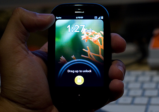
The Pre has an excellent screen. I was expecting more based on all of the early reviews of the device, but it’s still pretty good. Pure pixel density gives it a nice advantage here. Both the iPhone and the Pre have a 480 x 320 display; the iPhone’s display measures 3.5” on its diagonal while the Pre’s is only 3.1”. Cramming more pixels into less space makes the Pre’s display look sharper.

The Pre, like the iPhone, uses a multi-touch display. The touching works fairly well, almost as good as on the iPhone and far superior to any other touch phone I’ve used.
There are some differences of course.
The basic gestures are the same between the Pre and the iPhone. Pinch two fingers to zoom in, move them apart to zoom out. Flick your finger up or down the screen to scroll; do the same left/right to flip through pages, photos or cards. And double tap to zoom in on a web page.
On the iPhone, the multi-touch interface is limited to its large screen. The Pre doesn’t have as large of a screen but Palm attempts to make up for it by enabling touch in the area directly below the screen. Palm calls this the “gesture area”, which always seemed odd/misleading to me. You do perform certain gestures down there (wow), while others must be done on the screen itself.
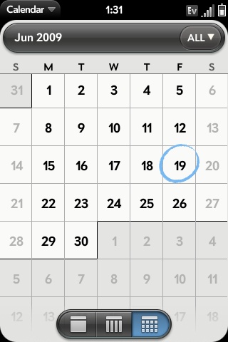
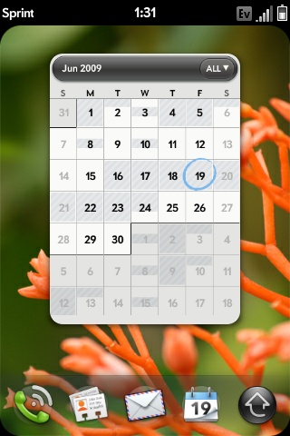
The gesture area, as Palm calls it, helps extend the usable touch area of the screen, which is good. The gesture area happens to have a physical button in the middle of it, which is bad. There’s one frequently used gesture you perform in the gesture area, it’s a right to left swipe. This is how you traverse through a hierarchy of “windows” within a single application. For example, to get from here:

To here:

You perform that right to left swipe in the gesture area.
The problems with this gesture are two fold:
1) The R/L swipe goes over the protruding center button in the gesture area; it feels odd. Update: You can perform the gesture in the area to the left or right of the center button, effectively eliminating this issue. Sweet :)
2) More importantly, there’s a lag between when you complete the gesture and when the application responds to it. This isn’t really true for any of the other gestures, just this one. It hampers the user experience.
On the iPhone’s virtual keyboard, whenever you tap a key it enlarges in size above the key so you know what you hit. It’s a way of getting around the problem of your finger covering up most of the keys on an otherwise tightly packed keyboard. The Pre has a physical keyboard and thus doesn’t need such a thing, but for regular taps on the screen Palm does implement a cursor of sorts. Tap on the screen and you’ll see a little dot with ripples around it. It’s not huge but it does give you an indication of where you tapped.
While the Pre’s screen is just as responsive as the iPhone, I found the Pre is far more likely to ignore my taps than the iPhone. It seems like a software issue as I’ll sometimes tap the same item two or three times before it actually clicks on it for me. It’s not the end of the world, but annoying enough when it happens.


91 Comments
View All Comments
carniver - Wednesday, June 24, 2009 - link
That doesn't make sense entirely. You enlarge the detail by zooming in, and you diminish the detail by zooming out.