For me, Palm was the one that got away. I don’t exactly remember what made me buy my Palm V but for the life of pocket organizers, nothing ever supplanted it. After a year and a half long stint with the Palm V I tried moving to a bunch of Pocket PC based organizers. The iPaq was the most recognizable of them all, and it seemed like as functionality went up, usability decreased.
I went through a ridiculous number of PDAs but none ever came close to being as useful for me as my old Palm V. I could play music and movies on the newer ones, but I never used them as religiously as I did the old V. I’m not sure what it was, but Palm got the UI right for keeping my notes and calendar organized. As cumbersome as the handwriting recognition seems to me today, back then I was very fast with it - it just made sense.
To be honest, it wasn’t until the iPhone that I ever truly got over my Palm V. When I heard that Palm was brewing an iPhone competitor, it seemed fitting.
This is the Pre:
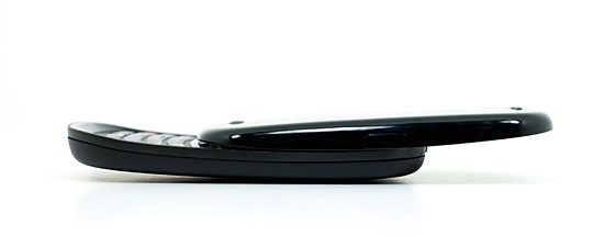
And while it won’t destroy the iPhone, it will land more than a few blows to the smartphone posterchild. In my opinion, it’s the first real alternative I’ve seen since the iPhone launched.
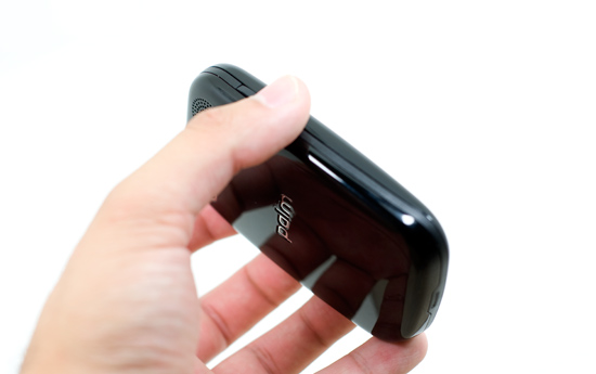
The Pre is unlike any device Palm has ever produced. Sure it delivers the same functionality as many Palm products, but it shares more in spirit and soul with the iPhone than any other Palm product or than the iPhone does with any other smartphone.
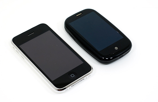
The Apple iPhone 3G (left) vs. The Palm Pre (right)
Palm created a brand new OS, which I’ve often said is the right way to approach a brand new device; one size fits all just doesn’t work outside of hats. It’s Linux based and is called webOS. It’s designed to be controlled via a touch screen using gestures and is ultra lightweight. Sound familiar? Did I mention that a former, kind of super important, Apple guy spearheaded the effort behind webOS and the first phone based on it?
Minimalism for the Masses
When the iPhone first hit, the fact that it only had four buttons was huge for a smartphone. The Pre echoes Apple’s design philosophy and features a similarly simple approach. When closed there are only 4 physical buttons on the device (5 if you count the volume up/down buttons separately).
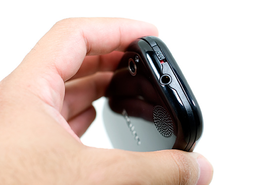
At the top of the device you have a ringer switch and a sleep/wake button, just like on the iPhone.
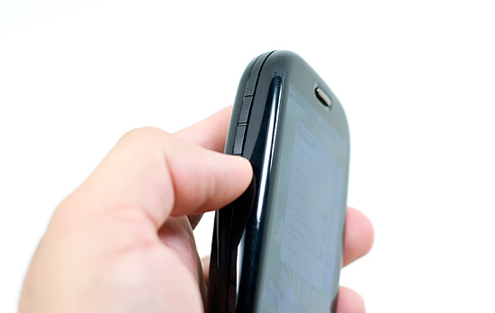
The left side of the Pre has a volume up and down button.
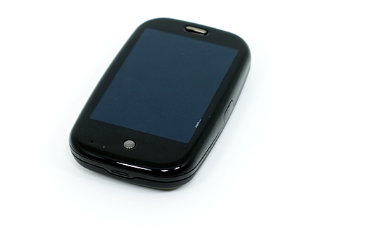
On the face of the Pre, near the bottom, you have a home button.
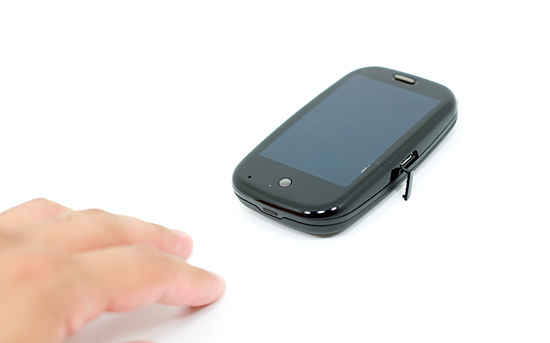
On the right side is a micro-USB port for charging and syncing the device.
Everyone says the Pre is plasticky. Well, it is made out of plastic. The build quality isn’t great, compared to the iPhone that is. Compared to most other phones the Pre is quite good.
Part of the problem is that Palm (and most other companies) isn’t as good at making things feel indestructible as Apple. The other part is that the Pre has a slide-out keyboard; it’s difficult to make a lightweight product with moving parts feel solid. The Pre is decent in this respect, but the part that houses the screen and the part that houses the keyboard will wiggle a bit, independently, when the Pre is closed.
Even the individual buttons on the Pre don’t feel as good as those on the iPhone. The ringer and sleep switches both feel cheap.
The Pre also doesn’t seem like it would take a fall too well. Granted I’ve seen cracked iPhone screens, but the construction of the Pre doesn’t feel all that sturdy. A tough Blackberry, the Pre is not. For Palm, this is most likely a learning experience as well as a cost balancing act. Palm will get better at making these things, but the cost side is difficult to deal with.
Overall the Pre looks good but it just doesn’t feel as good as it looks unfortunately. Again, if your comparison point is the iPhone you’ll be disappointed. If it’s any other phone, you won’t be.


91 Comments
View All Comments
Shadowmaster625 - Monday, June 22, 2009 - link
What is the most important feature of a phone with unlimited data? Obviously it is to be able to provide a broadband internet connection for my desktop pc so I can get away from the comcast bloodsuckers. I find it curious that Anand doesnt even answer this most important of questions. lol. One can only wonder what kind of world Anand lives in ... sheesh... only a moron would do anything more than talk or txt on one of these stupid things.T2k - Monday, June 22, 2009 - link
Like in many other occasions AT misses the point again - Pre is nothing like the iPhone, let alone aiming at it. If it's aiming anything then it's rather the Blackberry and its integrated communication services - which iPhone never came even close to, let alone matching it.iPhone is a geek (music/net/media) phone but NOT a smartphone - what kind of a smartphone could it be with NO MULTITASKING whatsoever?
You might can get almost as much stupid little apps as on WinMo - I doubt it though - but the lack of multitasking by itself makes it immediately a laughable proposition, let alone the long-missing other features that took Apple 2+ YEARS to fix, only to catch up with top phones from 2007...
Typical Apple-RDF idiocy at its best - Anand really needs to pull out his head of Jobs' @ss and needs to take a reality trip to overseas and see how laughable his iPhone is when compared to high-end phones in Europe and Asia (as a matter of fact it's quite embarrassing to have an iPhone in Japan.)
There's a reason why Blackberry beats Apple even in the US, which is typically the strongest market for Apple - it's the fact that iPhone is a reat piece for pseudo-business people but no real corporate person would touch it (would you give out your most sensitive communication for Apple? Because that's what you do with iPhone.)
Palm Pre is FAR AHEAD of iPhone but it's not a big step - there are plenty of phones well ahead of iPhone, there's nothing to see here in this regard, sorry.
finbarqs - Monday, June 22, 2009 - link
Here's what I think that needs to be improved:The balance of the phone. The phone is top heavy, making it very difficult to use it single handed. Additionally, the keyboard is too far away from the screen to call it "useable" with the screen when you have it with one hand. This makes me wish it has a virtual Keyboard! Battery life... well.. is left to be desired. Full charge at 3PM (more like 2:30) talked 3 times, but texted a lot, used e-mail and AIM. lasted t'il approximately 10PM. the talk times lasted approximately 3-4 minutes each.
Slow reaction when launching applications: Anand hit the nail on the head on this one. Still nice, but not as fast as apple. Still time for improvements on this one!
Anyways, Now that the iPhone has 3.0 out, I think it's a serious contender in the smartphone world! Palm pre also lacks video recording and the AF of apple's iphone 3Gs!!!
Ehsan - Monday, June 22, 2009 - link
Hi Anand,When starting messaging part of your review you opened with "The iPhone perfected text messaging". Can you please explain what you meant by this? Did you mean to say that they perfected it from the original one came on 1st Iphone or you meant they perfected it for all smartphones? Because if you meant later you are wrong. It was Palm who implemented threaded sms/mms in Palm OS in Treo 650 times and later customized it on Win Mob for their WM based treos. They were the first and only one till Apple copied that idea. How is that for wakeup call Apple fansboys??
Thanks.
Ehsan
T2k - Monday, June 22, 2009 - link
Nope, it's just another idiocy - iPhone NEVER been a desired texting phone, let alone bringing anything new (originally there wasn't even landscape email writing, let alone the still-missing MMS) - this is just one of the countless ignorant and stupid claims of this article.
Again, Anand badly needs to do some research before he starts putting out more of this kind of embarrassingly ingorant articles...
Sazar - Tuesday, June 23, 2009 - link
I think what Anand is trying to suggest is the format of texting in the iPhone is what is almost perfect.It is essentially like a chat, a running conversation between the parties concerned.
Using various other phones, I became accustomed to running conversations, but they were never really structured. I am sure other phone makers have excellent implementations, but the iPhone really did raise the bar for me.
With 0S 3.0 and it's landscape keyboard, it is doubly awesome :)
Ehsan - Wednesday, June 24, 2009 - link
I fully understand what Anand may be trying to suggest but what I want Anand and you to know is this running conversation between parties, like chat, is called "threaded messaging" which Palm introduces in its Treo 600 days. It was perfect and Palm included IM into it in their new WebOS so not only your sms and mms are in chat format but also your aol and gtalk IM's are in same chat window.What I am suggesting is please give credit where credit is due. Apple implementation of "threaded messaging" is carbon copy of Palm's version which they introduced long time ago in treo 600. Please check out history.
T2k - Monday, June 22, 2009 - link
How about this one?" Coming from the iPhone, this is a huge omission (Apple probably holds the patent on awesome predictive text input, Palm would probably have to clean Jobs‘ toilets weekly to get access to that one). "
Yeah.... you know, it's more than awkward to read things like this in a well-publicized article from a well-known person, on a much-hyped site...
...because this level of ignorance, lack of even basic research (there are at least half a dozen predictive text technologies out there and iPhone is pretty far from being the best) would immediately result in a permanent publication ban at any half-decent news organization or site.
In best case - say you are a junior journo - your editor would be reprimanded and you would be put back in some associate position but in worst case - if you were an editor - you'd be released immediately.
JC Strat - Monday, June 22, 2009 - link
Dear Anand,I hesitate to point this out....
Several of the sites (slashdot, facebook) that you loaded on the iPhone 3GS loaded disproportionately faster on the 3GS than the pre based on other site load times.
It has been suggested that these sites detect the user agent of the iPhone and serve up an optimized site for the iPhone. This has been suggested by using a user agent switcher with Safari. Set it to "Mobile Safari 3.0" - the iPhone browser - and the site loads much quicker even on the same mac.
From a recent post at Precentral.net:
--------------
Even if you don't have an iPhone, you can test it yourself if you have a Mac, and are running Safari 4. Go to the Develop menu on a new tab, and change the user agent to Mobile Safari 3.0 and load up slashdot.org. Now open a new tab (the user agent will default to the regular one) and open up slashdot.org. Compare the two. Notice the differences? Of course the one on iPhone loads faster- it's a different freaking version!! Similar thing on facebook.com.
--------------
Can you confirm that your tests loaded the exact same version of these pages, and that facebook and slashdot did not serve up different versions of their content to the iPhone that was less data or optimized specifically for the iPhone? The evidence seems pretty compelling that if your user agent is "Mobile Safari 3.0" you get a different version of the page, and comparing that with the Pre loading the full generic site is not valid.
I mention this because a variety of news and gadget sites have carried this as evidence of a 20+ % advantage of the iPhone 3GS over the Pre in rendering web pages. If they are not rendering the same page and data, then that needs to be explicitly acknowledged.
It may be that this turns out to be nothing, and the 3GS is rendering the exact same data and page that much faster than the Pre on these sites. But the discrepancy and possible explanation of an iPhone-optimized page should be explored and brought to light.
Personally whether it's 24% or 6% faster than the Pre, I couldn't care less. They are both awesome phones. However, it is appropriate to give the Pre a fair shake.
TheJediSlayer - Sunday, June 21, 2009 - link
Very, very extensive article between the iPhone and the Palm Pre, which I like.Although the iPhone has a quicker response time, smoother layout, and is more sturdy, I have to nail it in this respect. The fact that the iPhone has a "closed" application network for users and that the iPhone doesn't allow for multi-tasking makes the phone looks very undesirable, for me at least.
However, the Palm Pre has an "open" network for application downloading where everyone can contribute to it, like Androi's market. They offer multi-tasking, which is a MUST need for me and I'm sure just about everyone else.
The one thing that disappoints me about the Palm Pre is not its short-comings when it comes to Syngery, IMing, or anything else It's rather the fact that the device itself doesn't sound physically sturdy, as pointed out in the article. I'm sure it would take a big of doing to smash the Palm Pre, but I'm sure I'll end up dropping my own Palm Pre and I want to know that I'm not about to end up with a dead-unit because of one drop.
Nevertheless, the Palm Pre is something I will most definitely consider as I prepare to get my first smartphone in the coming months. I'd much rather the Palm Pre have the Android OS loaded onto it, rather than its own WebOS, but perhaps its changeable?