Oh Hashmir, I’ve Used This Title Too Much Already
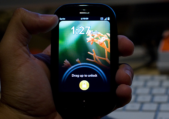
The Pre has an excellent screen. I was expecting more based on all of the early reviews of the device, but it’s still pretty good. Pure pixel density gives it a nice advantage here. Both the iPhone and the Pre have a 480 x 320 display; the iPhone’s display measures 3.5” on its diagonal while the Pre’s is only 3.1”. Cramming more pixels into less space makes the Pre’s display look sharper.

The Pre, like the iPhone, uses a multi-touch display. The touching works fairly well, almost as good as on the iPhone and far superior to any other touch phone I’ve used.
There are some differences of course.
The basic gestures are the same between the Pre and the iPhone. Pinch two fingers to zoom in, move them apart to zoom out. Flick your finger up or down the screen to scroll; do the same left/right to flip through pages, photos or cards. And double tap to zoom in on a web page.
On the iPhone, the multi-touch interface is limited to its large screen. The Pre doesn’t have as large of a screen but Palm attempts to make up for it by enabling touch in the area directly below the screen. Palm calls this the “gesture area”, which always seemed odd/misleading to me. You do perform certain gestures down there (wow), while others must be done on the screen itself.
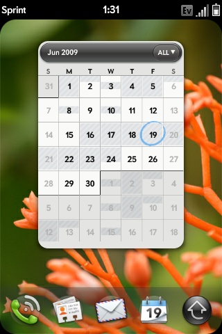
The gesture area, as Palm calls it, helps extend the usable touch area of the screen, which is good. The gesture area happens to have a physical button in the middle of it, which is bad. There’s one frequently used gesture you perform in the gesture area, it’s a right to left swipe. This is how you traverse through a hierarchy of “windows” within a single application. For example, to get from here:

To here:

You perform that right to left swipe in the gesture area.
The problems with this gesture are two fold:
1) The R/L swipe goes over the protruding center button in the gesture area; it feels odd. Update: You can perform the gesture in the area to the left or right of the center button, effectively eliminating this issue. Sweet :)
2) More importantly, there’s a lag between when you complete the gesture and when the application responds to it. This isn’t really true for any of the other gestures, just this one. It hampers the user experience.
On the iPhone’s virtual keyboard, whenever you tap a key it enlarges in size above the key so you know what you hit. It’s a way of getting around the problem of your finger covering up most of the keys on an otherwise tightly packed keyboard. The Pre has a physical keyboard and thus doesn’t need such a thing, but for regular taps on the screen Palm does implement a cursor of sorts. Tap on the screen and you’ll see a little dot with ripples around it. It’s not huge but it does give you an indication of where you tapped.
While the Pre’s screen is just as responsive as the iPhone, I found the Pre is far more likely to ignore my taps than the iPhone. It seems like a software issue as I’ll sometimes tap the same item two or three times before it actually clicks on it for me. It’s not the end of the world, but annoying enough when it happens.


91 Comments
View All Comments
TheProf - Saturday, June 20, 2009 - link
That's because to most non-PhoneGeeks, a good interface to a feature is more important than the feature itself. Usability trumps power in most if not all cases.If a feature is too hard to find or too hard to use, it might as well not exist, for whatever values of 'too hard to find' or 'too hard to use' apply. "pack[ing] as many features into a phone to make it a powerful device" may appeal to tech geeks, but it doesn't fly with the broader computing audience, let alone the general public.
That's the true overriding 'feature' of the iPhone and the Pre; they take features that existed in previous phones, but were so complicated that hardly anyone used them, and made them things that a much broader audience actually *enjoy* using.
cplusplus - Friday, June 19, 2009 - link
Now I'm not actually expecting a G2 review at any point, but Android is only brought up twice in this whole review? The G1 has been out for 8 months and already pulls from the cloud (Google natively, and I believe it can pull from Facebook) and has multi-tasking. Two of the things you say you really like about the Pre. The G1 isn't as good as the iPhone (for the most part), and I know that, but the G2 is supposed to be much better, and I would like to see how Android stacks up against webOS, at the very least.Anand Lal Shimpi - Friday, June 19, 2009 - link
I played with the G1 while writing this review, while I think the OS has some definite promise - the current hardware is just disappointing. Multitasking has been around long before any of these phones, yet it was the Pre's interface and relative quickness that made it a very desktop-like experience. The next-generation of Android based phones will hopefully deliver a full set of gestures and better performance; I think that would be the appropriate time to look at a comparison.To my knowledge, Android doesn't natively handle Facebook integration and has no mechanism for removing dupes between Gmail/Facebook contacts on the fly. Google (Android) is closer than anyone else (other than Palm) right now though.
Take care,
Anand
mrhumble1 - Friday, June 19, 2009 - link
This is kinda disappointing, Anand.You are saying the G1 doesn't cut it simply because of Facebook integration??
Newsflash... plenty of people (and phone geeks) don't care one bit about Facebook. That's a terrible reason to knock the G1.
As for hardware, the G1 shouldn't be judged only for its hardware. The G1 is all about Android.
The G1 has PLENTY of functionality that most review sites completely ignore. Does the iPhone (or Pre) have widgets? Do either of these phones have skins/themes/ or home screen replacements that include custom icons/backgrounds? These features greatly enhance the customization/usability options of the phone yet nobody seems to care.
I use apps every day on my G1 that Apple would never allow on the iPhone. The Pre may have great synching capabilities, but it has a similar notification bar like the G1 yet nobody gives the G1 credit.
You say the Pre gives a better "desktop experience" but the G1 is EXACTLY like using a laptop. I have the icons where I want them, I use the app tray like the Start button (XP), I have shortcuts to every function I could want, and separate home-screens for each category of app (Home, Settings, Games, Contacts, Multimedia, etc.), I have widgets set up on the various screens that provide me with information and functionality (from weather to wireless settings)... the list goes on. I haven't even mentioned the browsers which are excellent.
I often jog with my G1. Here's what it does for me:
-I open one app that plays streaming internet radio (over stereo bluetooth)
-I turn on the GPS and use another app to track my workout. The app reads back my elapsed time and distance aloud so I don't have to interrupt my music or look at the phone to check my stats. Then, when my run is done, it uploads the info and emails me a summary of my workout which includes a map and detailed stats regarding time and distance.
Can the iPhone/Pre do that? The iPhone can't even run 2 apps at once!
Android is not a small player in this game. Let's give it a little more credit, ok?
J
Anand Lal Shimpi - Friday, June 19, 2009 - link
I think this is the key point we differ on:"As for hardware, the G1 shouldn't be judged only for its hardware. The G1 is all about Android. "
I agree that the G1 is nothing without Android.
I agree that Android is extremely important.
But where we disagree is the value of the hardware. In my eyes, the G1's hardware keeps it out of the running for the top places. It lacks all of the major gestures that the iPhone and Pre support and the UI/device is much, much slower.
Many PCs can run an impressive set of applications, but what we're looking for is the right combination of features and performance - the latter just isn't delivered by the G1. I do fully expect future versions to fix that however, I just don't believe the time is now. And I believe most of the reviews of the G1 echo my sentiments; the hardware doesn't do the software justice.
Take care,
Anand
cplusplus - Sunday, June 21, 2009 - link
Just as a quick reply, the only reason Android doesn't have multi-touch is because they were afraid they would get sued by Apple for having it. Everyone was. It's not big news/problem because since Palm has been in the PDA game much longer than Apple, they have patents that Apple are probably infringing, too. There are cooked roms out there that show that the G1's screen is fully capable of multi-touch. Now that Palm has shown that it can be implemented without being sued, I fully expect it to show up in the 2.0 version of Android.http://gizmodo.com/5150354/apple-stopped-multitouc...">http://gizmodo.com/5150354/apple-stoppe...-on-andr...
http://i.gizmodo.com/5146797/how-to-hack-android-f...">http://i.gizmodo.com/5146797/how-to-hac...itouch-w...
http://www.engadget.com/2009/01/28/apple-vs-palm-t...">http://www.engadget.com/2009/01/28/apple-vs-palm-t...
Griswold - Friday, June 19, 2009 - link
"Even the individual buttons on the Pre don’t feel as good as those on the iPhone. The ringer and sleep switches both feel cheap."But does the ringer switch fall off as easily as the one on my iphone? Personally, I dont care if some parts feel or look cheap, as long as they arent cheap - like the ringer switch on the iphone.
joos2000 - Sunday, June 21, 2009 - link
[quote] Pinch two fingers to zoom in, move them apart to zoom out.[/quote]Certainly it is the other way around?
aileen - Friday, July 3, 2009 - link
It is indeed a great resource to obtain information on this subject. Keep posting. Thanks.http://www.freshsmileclinic.co.uk/dental-implant-d...">http://www.freshsmileclinic.co.uk/dental-implant-d...
http://www.freshsmileclinic.co.uk/brighouse-dental...">http://www.freshsmileclinic.co.uk/brighouse-dental...
Hrel - Tuesday, June 23, 2009 - link
no, why would it be??? That would make no sense at all.>>> <<< to zoom in. <<< >>> to zoom out. How does that NOT make sense?