Evaluating Samsung's QHD AMOLED Displays
by Joshua Ho on July 16, 2014 6:00 AM EST- Posted in
- Smartphones
- Samsung
- Mobile
- Laptops
- Snapdragon 805
- Galaxy S5
Recently, a package showed up at my door. While this is normally not worth talking about, the Galaxy S5 Broadband LTE-A happened to be in the box. For those unfamiliar with this phone, it's basically a refresh of the Galaxy S5. This means a Snadragon 805 SoC instead of Snapdragon 801. This also means a minor new revision of Krait (450 vs 400), a new GPU, and a separate MDM9x35 modem on a new process (20nm SoC vs 28nm HPm). This variant also ships with more RAM (3GB vs 2GB) and more internal storage (32GB vs 16GB). The display is also higher resolution (2560x1440 vs 1920x1080).
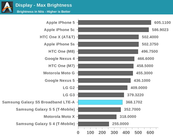
In terms of the resolution itself, the GS5 Broadband LTE-A doesn't seem to hold a significant advantage over the original Galaxy S5. While it's still possible to see the difference, once again I don't find it to be significant. It may be of value to others, but I think the PPI race needs to stop here, as I find it hard to justify the relatively minor resolution increase over the potential battery life gains and opportunity cost of pursuing higher pixel density over other display characteristics. Going to 4K would make even less sense at this display size, although there may be value to 4K in a tablet display. In the case of this display, I only see around a 10 nit reduction in brightness as the maximum luminance in auto brightness is around 430 nits, while on the older Galaxy S5 it was 440 nits. When set manually, the display has a peak luminance of 368 nits, a minor improvement over the previous model.
Of course, resolution isn't everything. Testing color accuracy is also important, which is the real surprise here. As always, these tests are run using an i1Pro for all measurements but contrast, and done using a custom workflow in SpectraCal's CalMAN 5. All color/grayscale measurements have been done in cinema mode as it is closest to targeting sRGB.
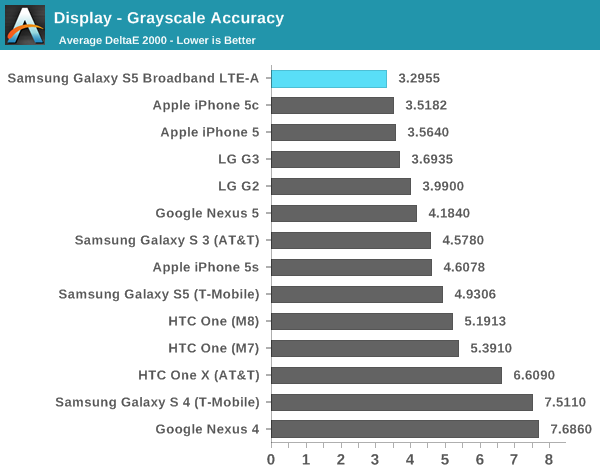
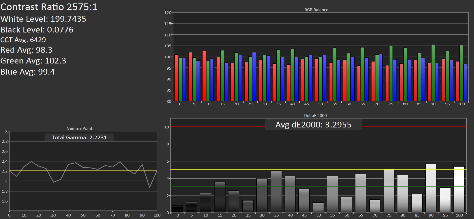
Based on grayscale alone, Samsung sets a new record for color accuracy in this department. It's definitely a healthy leap forward from the original Galaxy S5. In subjective viewing there are still some minor issues with excessive green in the color balance, but it's much better than before. The contrast is still just as dark as before. In a completely dark room, I can't tell whether the screen has turned off when displaying an all-black image.
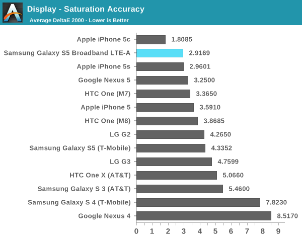
In saturations, Samsung has done an incredible job of calibrating the display. Just looking at the graph of dE2000 averages, there is clear improvement from generation to generation. Samsung is now tied with Apple for color accuracy in this department.
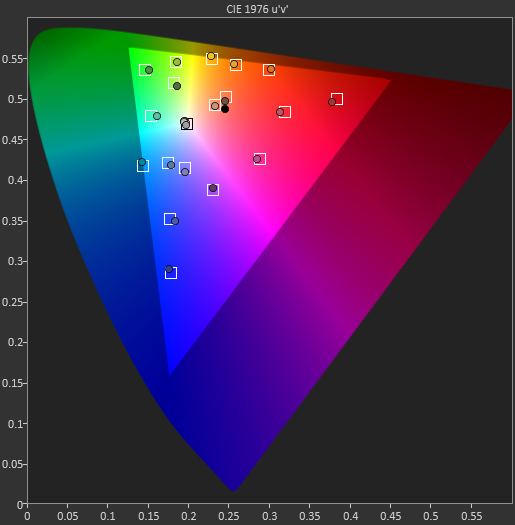
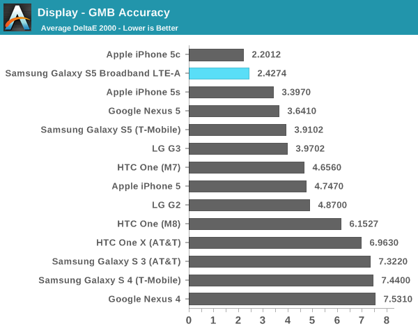
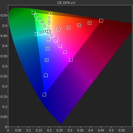
While the saturation test is important, it's often not as rigorous at the GMB ColorChecker test. It's fully possible for a display to do well in the saturation test but fall flat in this one. Fortunately, this isn't the case here. Samsung has managed to approach the iPhone 5c in calibration accuracy here, easily setting a record amongst Android OEMs. The difference in color is definitely noticeable when compared to a Galaxy S5, and I hope that every Android OEM follows Samsung's lead in this department.
Based upon this initial evaluation of Samsung's first quad HD AMOLED display, things are looking good. There is a small drop in the maximum luminance but nothing significant. The next critical piece of the puzzle is whether power draw is significantly worse on the Galaxy S5 Broadband LTE-A, although those results and the full review aren't quite ready yet. While only one aspect, things are currently looking up for the GS5 Broadband LTE-A, even if the name is a bit long. This may also represent a change in the future of mobile displays, as AMOLED increasingly seems poised to supplant LCD technologies. Unfortunately, as Samsung seems to be the sole supplier of such displays other OEMs are unlikely to adopt AMOLED until other vendors catch up with equivalent technology.


71 Comments
View All Comments
saru44 - Wednesday, July 16, 2014 - link
'That' is a solid improvement ! Have to give due credit to sammy here for the screen..saru44 - Wednesday, July 16, 2014 - link
Though I really wish they (and every other manufacturer out there for that matter) stick with FHD for the mobiles..repoman27 - Wednesday, July 16, 2014 - link
Why, in the name of all that matters to anyone, are so many commenters on tech enthusiast sites bemoaning the arrival of displays like this?!?!? It's the best quality display, by every metric except for potentially power draw (and the jury is still out on that one) to ever grace an Android phone. It's insanely close to the holy grail of 4.9", 2560 x 1440 (easily pocketable, 600 ppi), and the only thing it might have sacrificed to get there is a little bit of the power budget. This is the direction ALL OEMs should go, so that in a couple generations they'll become even thinner, brighter and draw less power. Furthermore, accurate color is something that should be applauded whenever we encounter it, not simply dismissed with a hand wave.I'm not sure if it's just people being uncomfortable with specs advancing this rapidly, but why is everyone trying to put the brakes on when we're so close to the end goal here? I've been waiting for literally 20 years for LCDs to get to this point! Being able to reproduce type on an LCD with no visible aliasing or blurriness from font "smoothing" is absolutely where we want to get to. Is everyone posting these comments too young to remember the laser printer (and, shortly thereafter, inkjet) revolutions? Do you not remember how awful printed documents looked before we got to resolutions of at least 600 dpi?
victorson - Wednesday, July 16, 2014 - link
And could you please kindly elaborate on why suddnely 4.9" Quad HD with ~600ppi is the holy grail?WithoutWeakness - Wednesday, July 16, 2014 - link
He said the reason right in the middle of the second paragraph."Being able to reproduce type on an LCD with no visible aliasing or blurriness from font "smoothing" is absolutely where we want to get to."
4.9" QHD isn't necessarily a "holy grail" but 600dpi is around the range where pixels are so small and close together that pixels cannot be distinguished from each other when viewed from a normal ~8-12" viewing distance unless you are holding a magnifying lens to it. Anti-aliasing and font smoothing "tricks" are no longer needed. repoman27 selected 4.9" as his example because it's a "large enough" screen for most while still being pocketable and easy to hold with one hand for the majority of people.
inighthawki - Wednesday, July 16, 2014 - link
"4.9" QHD isn't necessarily a "holy grail" but 600dpi is around the range where pixels are so small and close together that pixels cannot be distinguished from each other when viewed from a normal ~8-12" viewing distance unless you are holding a magnifying lens to it"I'm sorry, but that point comes WAY before 600DPI. I have 300DPI devices which I struggle to see individual pixels from only 2-3 inches away. 600DPI is overkill for today's world. Those extra pixels could be sacrificed at nearly no cost to the end user (visually) and provide drastic improvements to battery life and brightness settings for the display.
Veedrac - Wednesday, July 16, 2014 - link
I'm with repoman27; your ability to distinguish pixels does not seem to be the same as mine.Take an image with a freeform aliased solid 1px line zoomed at 100%. You should easily be able to see jaggedness. This is relevant in the ability to display high-quality text serifs.
My (rough) approximations are that I'll no longer be able to see jaggedness at normal distances (30 cm) from about 800ppi and up. That's the endgame.
inighthawki - Wednesday, July 16, 2014 - link
Well yeah, when you create a scenario that explicitly has tons of jaggies, it's possible to notice. But I have not seen OS shell UI that does not use antialiased graphics since like, Windows XP.Vi0cT - Wednesday, July 16, 2014 - link
While I agree with you for the most part, some east-asian scripts (the ones used in Japanese, Cantonese and Mandarin) do benefit from higher densities.Characters like these are pretty dense:
影響・鑞・鼈・憂鬱
So I believe it is a bit early to suggest that the PPI race should stop when people in huge markets (like Japan and China) do benefit from the improvements.
Now OEMs need to strike a balance between increasing densities and increasing(or at least maintaining) battery life.
inighthawki - Wednesday, July 16, 2014 - link
Fair point.