The Android 5.0 Lollipop Review
by Brandon Chester on December 1, 2014 10:00 AM EST- Posted in
- Smartphones
- Android
- Tablets
- Android 5.0
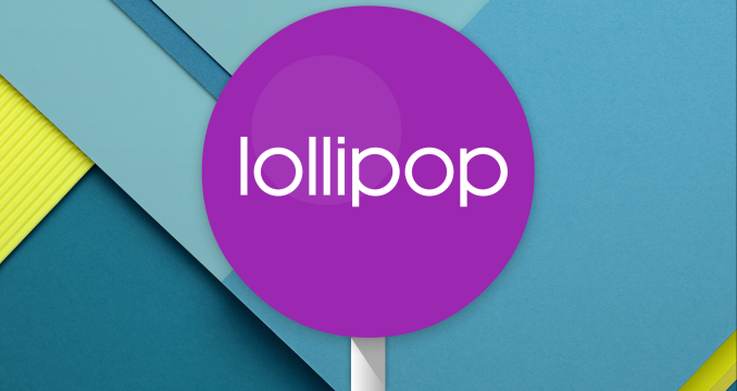
Google has been very busy with their expansion of Android as a platform this year. At Google IO we saw the announcement of endeavors like Android TV and Android Auto. But the stars of the show were a preview of the next version of Android, code named Android L, and Google's new Material Design principles for interface design across all of their products. In the years since Android 4.0 Ice Cream Sandwich released, we've seen the launch of Jellybean and KitKat, but both of these versions were very iterative improvements upon 4.0 and had equally iterative version numbers with Jellybean being major versions 4.1 through 4.3 and KitKat being 4.4. Lollipop is given the major version number of 5.0, and it's quite fitting as it's arguably the biggest advancement to Android in a long time. It comes with an entirely new interface based on Material Design, a new application runtime, and many new features that I could not hope to summarize in this paragraph.
It can be difficult to begin a review of Android, as the definition of what Android is can be very dynamic. Android as an operating system that performs a set of functions is fairly well defined, but it's nearly impossible to define what Android looks like based on how it appears on most smartphones. The interface that Google has created for Android has matured greatly from its original iterations, but OEMs continue to put their own interfaces on top of Android to differentiate their devices. What applications are part of Android is also an interesting question. We can look to what applications are included in AOSP, but truth be told even Nexus users with "stock Android" aren't really getting an AOSP experience.
That may not be a bad thing for users, because many AOSP applications are quite bare compared to the Google applications that have superseded them. However, it poses a problem when deciding what should be discussed in a review of Android, and it has implications relating to how much of "Android" truly is open source. Google has also moved many applications over to Google Play so applications can be updated independently of the operating system, which bypasses many of the concerns about fragmentation from the days when application updates would come with Android updates that a user might never get. This adds an additional level of consideration when deciding which of these Google Play applications should be considered part of Android and discussed during a review.
For the purposes of this review specifically, I've attempted to take a look at most of the applications that come pre-loaded on a Nexus device which includes applications like Gmail that other people may contend are not actually part of Android due to them not being part of AOSP. It should also be noted that Google has been updating their applications to have a Material Design interface since it was originally revealed at Google IO, and some of the earliest updated applications have been excluded from the review as users are already very familiar with how they look an act by this point. We have covered many of these over the course of the year, and so readers who wish to see changes that were made to apps like Gmail and Google Sheets can look to our past coverage from when those applications were updated. To begin the review, we need to explain exactly what it means for something to have Material Design.


126 Comments
View All Comments
mmrezaie - Monday, December 1, 2014 - link
Do you mean now microsoft invented squares? ;-)I have used windows mobile, and its not that similar experience compared to android L although it is really really good if not counting the lack of apps. I think android with material design is kinda unique and almost new.
OreoCookie - Monday, December 1, 2014 - link
Microsoft's Metro design language was the first to prominently feature a flat, typography-centered, stark, and geometric UI. What Microsoft did here was start a trend rather than make a design that was copied piece-wise by competitors. iOS 7/8, for instance, are also stark, typography-centered and geometric, but they're not flat. Android is following, too, by simplifying shapes, etc. Duarte who is in charge of Android's UI design had similar plans for the ill-fated webOS (search for the last evolution of the UI which never made it into a product, a strikingly beautiful compromise between the aforementioned qualities with some whimsical elements sprinkled in).There is nothing wrong with adopting and adapting good ideas, quite the contrary.
kspirit - Monday, December 1, 2014 - link
A sensible comment!Yes, there's nothing wrong with it. I agree with you on all accounts. I am not saying they did wrong by it, but what I was saying was people are wrong to deny something so obvious.
Murloc - Monday, December 1, 2014 - link
people must have been sleeping not to notice the trend.I mean, just look at Anandtech.
10 years ago a style like this would have been completely ridicolous.
MonkeyPaw - Monday, December 1, 2014 - link
I think I would be fine without each mobile OS review talking about what came over (copied) from competing platforms. It's pretty obvious that the best or most logical concepts are coming through in the market, as they should.I was ready to
give this article a pass until we got to the Notification Center bit. Once the writer opened the door, then it became time to give other companies credit for good ideas, too. MS offered the flat UI with WP7, and it has aged so well that Apple and Google have followed suit.
Krysto - Monday, December 1, 2014 - link
Lollipop is a blatant copy of Metro? What are you smoking? Not only is Lollipop still very much Android-like much more so than anything related to Metro, but I actually believe material design > iOS7 > Metro. Yes, that's right - Metro is the ugliest of the 3 new design languages, while material design is the most advanced and more thought out. iOS7 is kind of amateurisly made, but Metro has some huge practical problems that make it the worst.kspirit - Monday, December 1, 2014 - link
Um. I'm not really commenting on how polished or refined it is. I didn't comment on usability either. I'm talking about purely appearance. Google might have made it a lot more usable than Microsoft ever could, but that still doesn't mean they didn't take design cues from Windows Phone...OreoCookie - Monday, December 1, 2014 - link
Yes, but Metro was first and set the trend. iOS 7/8 is also not a copy of Metro, Apple was taking some ideas (which had already been embodied in their hardware!) such as cutting embellishments, focus on type and a move away from skeuomorphism but the iOS 7/8 user interface is not flat at all: Windows Phone uses the scroll metaphor to connect screens while iOS uses zooms and other animations to create depth. In short, even though Apple took some grander ideas the result still feels like iOS. And ditto for Android 5: Google has taken some ideas (e. g. simplified the navigation icons on the bottom), but it still feels like Android. IMO Lollipop is an improvement.FunBunny2 - Monday, December 1, 2014 - link
I guess you weren't around before 3D widgets became possible in GUIs????Murloc - Monday, December 1, 2014 - link
Microsoft did not invent the Swiss Style.The trend has been to go towards it everywhere, Microsoft simply acted on it earlier than the others, being a trend-setter if you will.
But they did not invent anything.