Oh Hashmir, I’ve Used This Title Too Much Already
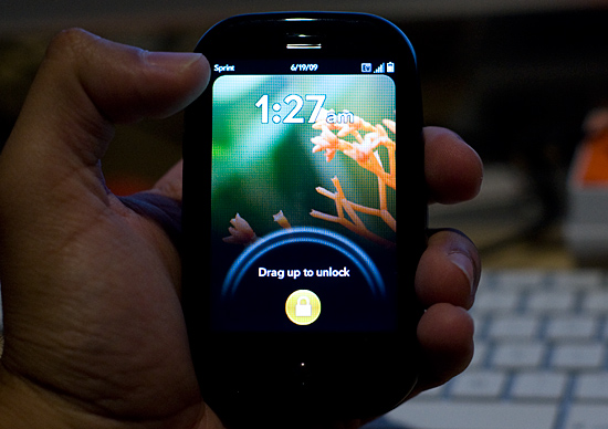
The Pre has an excellent screen. I was expecting more based on all of the early reviews of the device, but it’s still pretty good. Pure pixel density gives it a nice advantage here. Both the iPhone and the Pre have a 480 x 320 display; the iPhone’s display measures 3.5” on its diagonal while the Pre’s is only 3.1”. Cramming more pixels into less space makes the Pre’s display look sharper.

The Pre, like the iPhone, uses a multi-touch display. The touching works fairly well, almost as good as on the iPhone and far superior to any other touch phone I’ve used.
There are some differences of course.
The basic gestures are the same between the Pre and the iPhone. Pinch two fingers to zoom in, move them apart to zoom out. Flick your finger up or down the screen to scroll; do the same left/right to flip through pages, photos or cards. And double tap to zoom in on a web page.
On the iPhone, the multi-touch interface is limited to its large screen. The Pre doesn’t have as large of a screen but Palm attempts to make up for it by enabling touch in the area directly below the screen. Palm calls this the “gesture area”, which always seemed odd/misleading to me. You do perform certain gestures down there (wow), while others must be done on the screen itself.
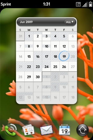
The gesture area, as Palm calls it, helps extend the usable touch area of the screen, which is good. The gesture area happens to have a physical button in the middle of it, which is bad. There’s one frequently used gesture you perform in the gesture area, it’s a right to left swipe. This is how you traverse through a hierarchy of “windows” within a single application. For example, to get from here:

To here:

You perform that right to left swipe in the gesture area.
The problems with this gesture are two fold:
1) The R/L swipe goes over the protruding center button in the gesture area; it feels odd. Update: You can perform the gesture in the area to the left or right of the center button, effectively eliminating this issue. Sweet :)
2) More importantly, there’s a lag between when you complete the gesture and when the application responds to it. This isn’t really true for any of the other gestures, just this one. It hampers the user experience.
On the iPhone’s virtual keyboard, whenever you tap a key it enlarges in size above the key so you know what you hit. It’s a way of getting around the problem of your finger covering up most of the keys on an otherwise tightly packed keyboard. The Pre has a physical keyboard and thus doesn’t need such a thing, but for regular taps on the screen Palm does implement a cursor of sorts. Tap on the screen and you’ll see a little dot with ripples around it. It’s not huge but it does give you an indication of where you tapped.
While the Pre’s screen is just as responsive as the iPhone, I found the Pre is far more likely to ignore my taps than the iPhone. It seems like a software issue as I’ll sometimes tap the same item two or three times before it actually clicks on it for me. It’s not the end of the world, but annoying enough when it happens.


91 Comments
View All Comments
viciki123 - Monday, February 22, 2010 - link
http://www.weddingdressonlineshop.co.uk/23-mermaid...">http://www.weddingdressonlineshop.co.uk/23-mermaid...jmyette - Wednesday, February 17, 2010 - link
I've been very disappointed by the Pre and had to switch back to my Treo 700p. I'd say of you like Palm OS and its effective PIM applications (calendar, contacts, tasks and memos), you probably won't like the Pre. Otherwise, I think the Pre may be a good choice. The best review of the Pre I found:http://palmprelansing.blogspot.com/2009/07/pre-rev...">http://palmprelansing.blogspot.com/2009...pre-revi...
http://palmprelansing.blogspot.com/2009/07/pre-rev...">http://palmprelansing.blogspot.com/2009/07/pre-rev...
s1ugh34d - Wednesday, July 15, 2009 - link
I'm lost on why the Iphone is the definition of a phone. Last I checked my HTC WinMo phone has just about all the same features. Can't a palm be compared to The Touch Pro. I see the journalistic approach, using palm vs apple. But others mentioned android why is anandtech so in love with their Iphones...Also wouldn't cell phone fall under "mobile" on the tab bar.
s1ugh34d - Wednesday, July 15, 2009 - link
I missed the messaging part. Since Iphone users can't use it, they don't know what multiple messaging is. Palringo, a WinMo/blackberry app, runs every IM service you ever had.Love the magnetic charger, My toothbrush has that, and I always thought that it should be used for small devices.
The palm does kick a little Iphone butt, but WinMo blows that phone away, they just need multi-touch on the touch pro2
Jeff7181 - Saturday, June 27, 2009 - link
A coworker of mine says the phone gets really hot when in use for extended periods of time. Not sure if it's from the backlight for the display or just the battery discharging. Either way, the result is a very hot phone and apparently a discolored screen. He's replaced his already once because of some yellowish discoloration at the bottom edge of the screen that spreads the more it's used.macs - Wednesday, June 24, 2009 - link
Guys take a look at the new HTC Hero with Androidmacs - Wednesday, June 24, 2009 - link
SorryThis is the link:
http://www.youtube.com/watch?v=FKTDSfbcbBU&eur...">http://www.youtube.com/watch?v=FKTDSfbc...r%2FHTC&...
bored2tears - Wednesday, June 24, 2009 - link
Techies, come on! Really? Are we such navel-gazers that we don't get it? Sure, my original Palm, my Tilt and my HTC phone could do stuff that the iPhone and the Pre can't do (yet). But that's not the point.It's ease of use!!!! The satisfaction of the UI!
I don't hit the start menu so I can scroll through file manager. I don't mess around with crappy windows mobile UI to find stuff. And when the new WM comes out, it will prove that ease of use is the point. That's the iphone feature that everyone wants to copy, and rightfully so. The companies get it while the techies play their little "mine is better than yours" one up spec game.
You can turn on my music on the iPhone and surf the web or open another app, etc. AT THE SAME TIME. That's what people want and do. Only people without an iphone don't know that there is some level of multi tasking. I can play most games or use most apps on the iPhone without stopping the music. If I close my web browser to open another app, my web app doesn't go back to the home page. That page stays open. When I click on the web app again, I'm where I left off. Why do I need to have my web browser open while I'm in another program anyway? Now if I'm using something like Pandora, it's a problem. (And that level of multi-tasking would be welcomed Apple!) If I use the pre, I don't have this issue at all. Either way, these phones are initially made for joe public to understand not just for sammy supertech savvy to gush over. And yet, these phones can go up the scale from casual user to business user like myself.
Anyone who's used the pre for an hour knows how absolutely cool it is. And that's a big factor. It's easy to use. Sure it's powerful and I still think these two smart phones (AND the G1) are great. But it's the UI stupid! That's what sells the phone. Don't hate them because they're beautiful. ;-) There is something under the hood.
Ehsan - Tuesday, June 23, 2009 - link
Hi Anand,I am sorry to ask but am bit curious did you use non formated sites for facebook & Slashdot because of too much discrepency of my Iphone 3GS and your numbers of it.
Also I was wondering if you can do a app launching test on Iphone 3GS with a 3rd party app as most of the native apps run services in background (I found this by installing backgrounder app from Cydia after jailbreak on 3G and found that many native apps were running in background already). So its not launching from standstill if its half running.
Thanks.
Ehsan
Hrel - Tuesday, June 23, 2009 - link
Att's network is completely useless. Their plans are INCREDIBLY overpriced, and they nickle and dime the living crap out of you... I will NEVER get any cell phone from ATT.That being said, cell phones need to transition to voip over WiiMax, once a Nationwide (world wide) WiiMax network is set up.
Data plans need to be INFITINE data, non of this 5GB per month bullshit!! Text IS data, as you said. Voice, well, is kind of data, and should be ALL data soon.
I don't think sprints network is reliable enough to switch though.
Battery life needs to hit 20hrs+.
I want a smart phone from LG, that I OWN, not that BELONGS to a cell phone company. So I can buy the phone, and take it to whatever network I want, Verizon, Net 10, Boost, Sprint, whatever. LG makes great stuff.
Can you PLEASE review the LG smart phones that ARE out, like the Env, and the other one that costs like 30 bucks more... I forget the name right now.