Prelude to Productivity: Cards
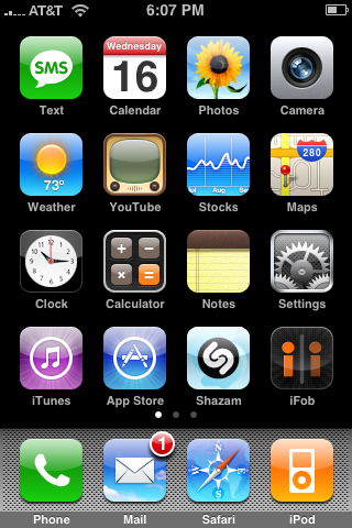
This is the iPhone’s home screen:

Busy, isn’t it?
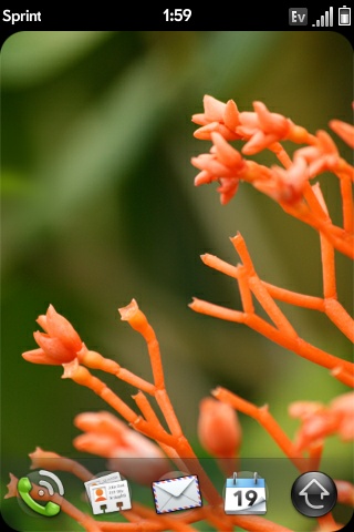
This is the Pre’s home screen:

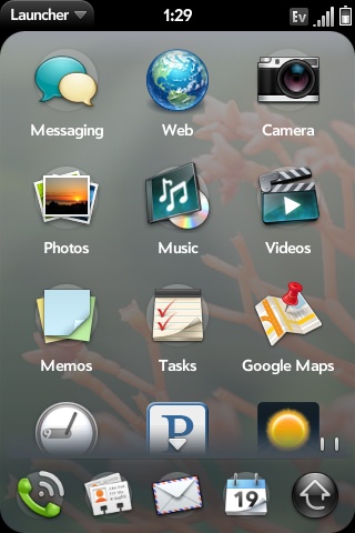
Not so busy. Ha! Apple just got out-minimalized. You get four quick launch buttons at the bottom of the screen, plus a launcher button. Tap the launcher icon and you bring up the webOS Launcher. Think of it like Windows’ Explorer or Mac OS X’s Finder. This is how you launch applications. You can scroll up/down in the launcher and it has multiple pages like the iPhone’s home screens.

We call them windows, Palm calls them cards. Each application opens in a new card. You can have multiple cards open at once and switch between them (hello multitasking). The Pre will alert you if you have too many cards open and prevent you from opening any more:
To switch between cards simply hit the center button on the Pre, then flip through the cards by flicking left or right on the screen. To start using a card, just tap on it.
To close a card, hit the center button the Pre then flick upwards - effectively throwing the card off the screen. Doing that closes the card and frees its associated memory.
And herein lies the key difference between the Pre’s webOS and the iPhone’s OS: you can have multiple cards open at once. The iPhone forces you to exit one application before starting another in an attempt to preserve the UI’s responsiveness (and maintain battery life), the Pre doesn’t.


91 Comments
View All Comments
carniver - Wednesday, June 24, 2009 - link
That doesn't make sense entirely. You enlarge the detail by zooming in, and you diminish the detail by zooming out.