Google Updates Hangouts For iOS With A New Interface
by Brandon Chester on June 29, 2015 5:57 PM EST- Posted in
- Smartphones
- Mobile
- iOS
- Tablets
Today Google shipped an update for their Hangouts application on iOS. The update brings the version number to 4.0, and rightfully so as it comes with a new design for the entire application. Although this is an iOS application, it feels very much like an Android application as it follows the same Material Design principles that Google's Android applications use.
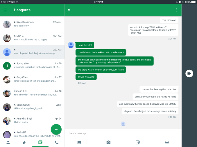
Above you can see the conversation view for the application running on an iPad. It still retains the bar to initiate a call with the person on the right hand side, which may pose a problem in the near future when users pull from that side to initiate multitasking on iPads running iOS 9. There are a few other iPad specific changes, such as a green circular send button that only appears when you've inputted text. The app has some issues with rendering on the iOS 9 beta so I can't take screenshots of them. All of the other changes that I note below exist within both versions, with the exception of UI elements that only exist in one of the layouts such as the navigation buttons at the bottom.

Old UI on the left, new UI on the right
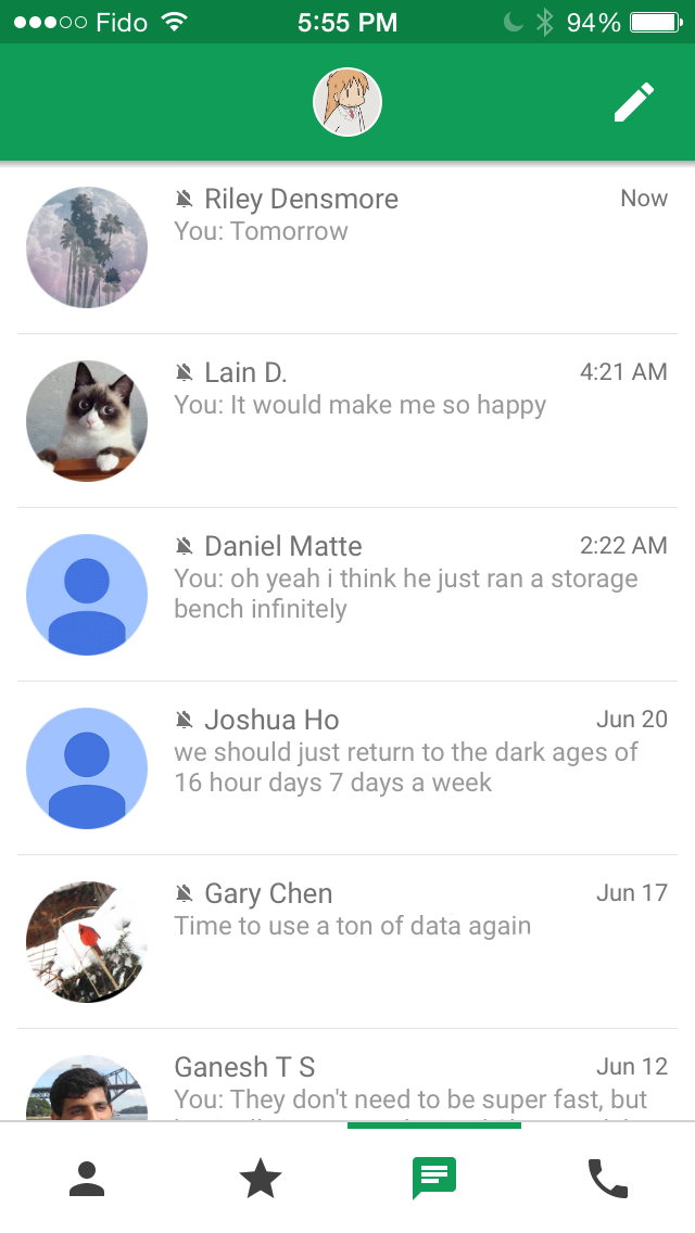
The main screen of the application only receives a few changes, but they're noticable. The app now adopts the circular button for starting a new conversation that has become standard in Google's applications, as well as the navigation drawer which can be accessed using the hamburger button in the top left. This is a difficult situation, because while the navigation drawer is used within all of Google's applications on Android, it's discouraged by Apple and their design guidelines for iOS applications. I think in this situation it would probably be better for Google to follow the guidelines of the platform they're designing for even if it means there has to be some fragmentation between the design of their apps on iOS and Android.
In addition to the new forms of navigation, there are some subtle tweaks as well. The fonts now use a thicker weight and are a blue color as opposed to the light grey they used previously. The increased contrast makes text a lot easier to read. This blue color is also used for the navigation buttons at the bottom. The only other tweaks I've noticed is the green bar indication which section you're in being moved from above the navigation buttons to below, and the separation lines between conversations being removed, which is something Google has done with their other applications as they redesigned them to follow the Material Design guidelines.
Old UI on the left, new UI in the middle and on the right
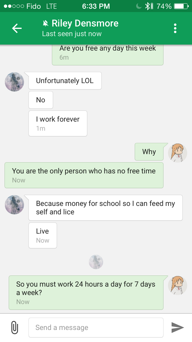
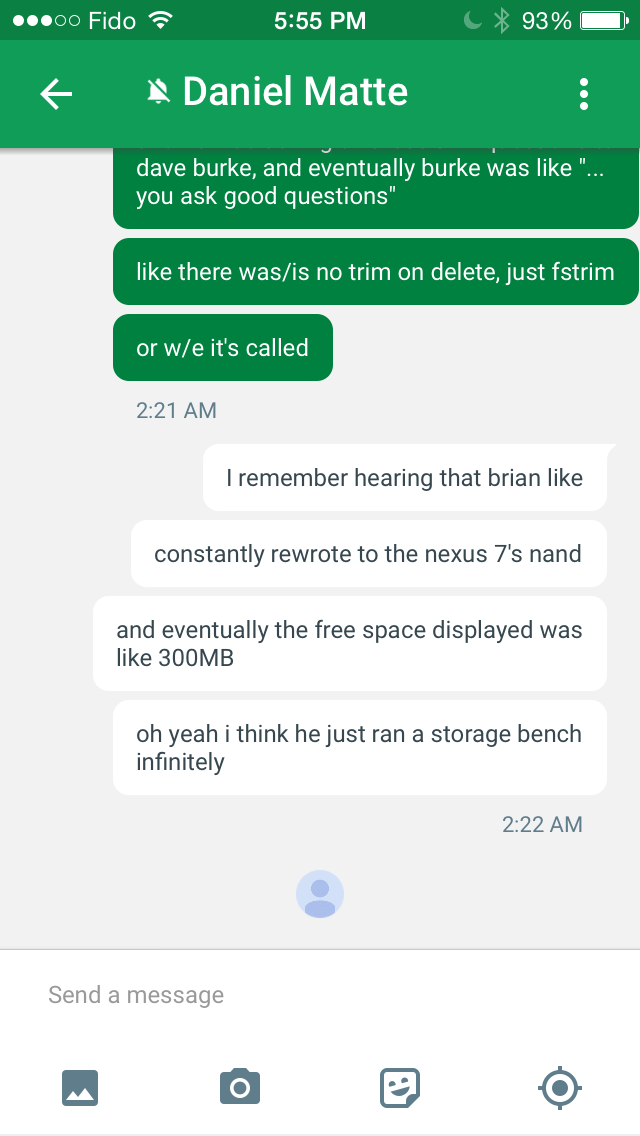
Once you go into a conversation you'll see that Google has been doing a lot of work to update the appearance of the app. The green color of the bubbles now better fits with the green color that Hangouts uses, and now the green bubbles are the ones sent by your conversation partner rather than by you. The bubbles themselves are also more rounded than they were before. Text within the white bubbles doesn't use the same blue used for the text in the conversation view, but it seems to be a lighter color than the black used before because there's visibly lower contrast between it and the white backgrounds. Text within the green bubbles now uses a white color to contrast with the dark text in the white bubbles.
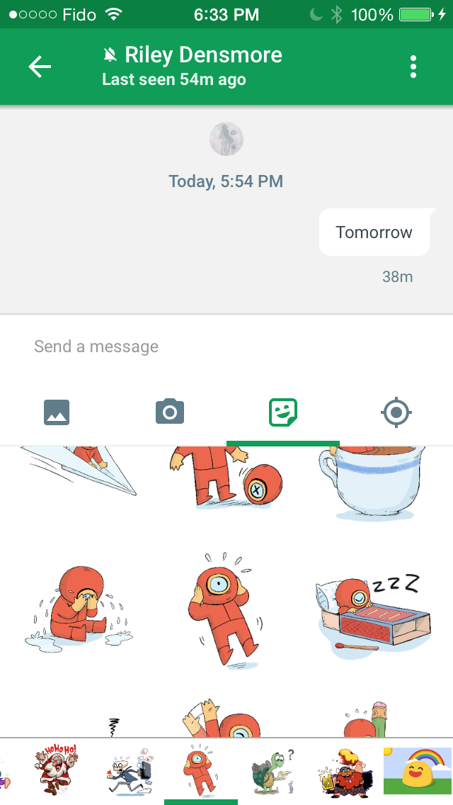
The input field also receives a number of changes. Rather than having a paperclip that leads to another menu, Google has exposed all the options for sending media right underneath the text box. This means that you don't fit quite as many messages on the screen as before, but I think it's a worthwhile change. You can now send images, take images to send, and send various little pictures to the person you're conversing with. Location sharing is supported as well, and the photos button allows you to send multiple photos at once.
Hangouts 4.0 for iOS is rolling out on the App Store, and you should be able to download it now for any iPhones, iPads or iPod Touches that you own. The new interface hasn't come to Android yet, but there have been recent leaks of a similar looking redesign on Android, and Google says that it will be coming soon.


16 Comments
View All Comments
vnangia - Monday, June 29, 2015 - link
And still no search for Hangouts. Thanks Google for failing at your job #1. Literally the only way to search is to go to a desktop and open Gmail. This is why I've replaced Hangouts with Whatsapp.Impulses - Monday, June 29, 2015 - link
Huh, I hadn't consciously realized that... Guess I just don't have much of a need for searching my convos, kind of basic functionality tho, most stock SMS apps have search even.cmikeh2 - Monday, June 29, 2015 - link
Google's stock SMS app has search for both individual conversations and the full inbox. Just a case of two teams not communicating well I guess.Adam8281 - Tuesday, June 30, 2015 - link
Agreed! As a Google Voice user, I would have gladly switched over to integrate my SMS with Hangouts, but for the fact that you can't search message history in Hangouts! (You can in the Google Voice app).soydeedo - Thursday, July 2, 2015 - link
The bad thing about WhatsApp is you can only use it on your phone, instead of having it sync across your desktop, laptop, tablet, and phone. That said, one thing I do like about WhatsApp is all the control it gives you over group chats. I can't stand the fact that you can't kick people out of room in Hangouts.soccerballtux - Friday, July 3, 2015 - link
I use whatsapp daily through my PC at web.whatsapp.comiwod - Monday, June 29, 2015 - link
If i did actually like Material Design, I would have switch to some decent Android Phone instead of using iPhone.name99 - Tuesday, June 30, 2015 - link
Let's keep the snark in check till we see what Apple Music on Android looks like...It will be interesting to see if they consider that to be an evangelizing app (which is Google's theory[?]) and so they cram it full of San Francisco font and iOS colors, swipe left to delete, swipe right to go backwards, etc --- all the places where Android differs from iOS.
I honestly don't know how that will play out. iTunes on Windows seemed to me to be a reasonable port to the Windows UI, insofar as the iTunes UI was something of an odd-man out on Mac, and didn't have any natural match on Windows. It didn't seem to gratuitously use non-Windows idioms, but maybe I didn't notice those because I'm not a heavy duty Windows user.
Safari on Windows DID use a rather different technique for text rendering, which generated a lot of talk. You can argue that that was Apple trying to do what it considered a better way of doing things [which is presumably what Google would also argue...], but it did make the app stand out from all other apps.
So I think we won't know till we see Music for Android.
soccerballtux - Friday, July 3, 2015 - link
I hate Google's UI direction with a passion, they call it Material Design Layer I call it Messy Desk Layers all those construction papers shuffling around and stacking and such. I would welcome the presence and hopefully it would kick Google in the tail to actually do something nice with the UI for a change.chrnochime - Wednesday, July 1, 2015 - link
If we actually cared what your preference is, we would've asked. As it is, don't care :D